Monday, 14 November 2016

Animation Reviews.

How You Will Die


This animation used visuals to get across the message of different statistics about how people will die in both richer areas, and poorer areas. The same animation was used when showing about strokes and our lungs for example. It was to the point and the images used were repeated, this made the animation memorable. The end message from this animation was that we will inevitably die, regardless of the location of where we live, whether we smoke etc, it was however powerful to see the difference between the information of rich and poor areas, the the reason of death.


Zero

This animation told the story of two people who were classed as the number zero. The number you were born with was the number you were classified as. For example those with number 9 were seen as better people than those with the number 1. This was shown in society with the way they treated each other, what jobs they had, what type of people they were etc. 
  The two '0' characters fell in love and had a baby, who was born with infinity, the highest number that the people had seen, consequently gaining unlimited respect from others. This translates into our society as people judge others by their upbringing etc.
 In regards to making the animation we can see the emotion the character goes through facial expressions as well as the weather ( pathetic fallacy). The colour of the characters also vary, those with higher numbers were given the body of pink, whilst the 0's had dull grey colours, upon first glance this may represent their emotions. The director created a moving animation that spreads meaning to everyone as we can all relate to this animation, the narrator in the animation tells the story, describing the thoughts Zero goes through as the dolls cannot talk. This is why facial and body expressions were important in this animation as the use of speech cannot be used.

Wednesday, 9 November 2016

Board Game Production.

A reflection on the brief

 After going through the brief I am exited to see what we can create, whether it be an original game consisting of traditional elements, or a reworking of a popular game. It is required to have a good name, logo as well as colour scheme, these elements allow us to be creative in our game whilst still sticking to the brief. The parameters ( things in which you must not do, the restrictions) for the brief include elements such as the game can not be harmful and it must not exceed the international paper size of A3, taking these instructions it allows us to narrow down our research to games in which are the correct size. The object requirements for the task are those in which the object (board game) must achieve, these include a good name, logo, include traditional elements and a clear target audience.
      For this task I intend to work in a team as that way we can produce more creativity and come up with an original game that can fill all of the key elements, which in the long term produces a completed game that is successful. By working in a team you are able to gather more research that you can evaluate, in addition to this I believe I work best in a team as we can put our ideas together and you can also have a range of opinions and different ideas which when out together create a good project.


Production List

 As I decided to work in a group we can each be assigned individual tasks to complete during the production of the game. These can vary from logos, to moving pieces etc. By creating a table it allows us to individually keep to our jobs and we can also alter the secondary research we do as individuals as different research will apply to different tasks.


Research

     In relation to research I can carry out primary research, field research and secondary research. To start of we explored a few games in which could be played using only a pen and paper ( hang man etc) this allowed us to think of games in which don't include playing pieces. In addition to this I can go out to shops and look at the already existing board games, exploring the size, layout, type/font, and the general idea of how to play the game. By doing this research it allows us to gather ideas from the already existing successful games to put into our own project, and also widens our ideas on the already existing and popular fonts and colour schemes that are used. 
  Once the information and research is gathered we can put our evidence into tables, both using a written explanation as to what we discovered as well as photographs to show what we found out.  Graphs as well as charts can be used to show our research as it is a good way to organise our information and compare and contrast the research we gathered.
   In regards to the type of things we can research, I intend to look at already existing fonts used for the titles, the colour schemes and general visual style of games. For secondary research we can look on the internet as well as use books and/or similar briefs. We can research not only board games, but go deeper into the individual points such as fonts, looking at what types are successful with particular audiences.  
  Currently I do not have any particularly 'creative' ideas however after our research I will be able to look at what already currently exists and take inspiration from these games, and take some of their ideas into consideration with intentions to merge them with my own and others ideas.


Evidence Of Prmiary Research

  After going into Waterstones and exploring the existing board games, as a team we have decided to perhaps do a twist on the popular game Monopoly. In the shop we saw the existing version of monopoly that was a twist of 'Game Of Thrones' and after seeing this we decided to reinvent it and do a twist on the show 'Pretty Little Liars'.  We gathered photographs of a variety of games that had different target audience, as well as logos and fonts etc. 


Here's the example we saw in the shop, it is an alternative version to the classic monopoly board as it includes different names and playing pieces. We can incorporate this into our own version by changing the colour scheme as well as playing pieces and locations.

To the right is another example of an edition of monopoly that we found in Waterstones, this being the retro version, therefore an entirely different colour scheme. In addition to the change in colours the target audience also varies. The Game Of Thrones edition is targeted at an older audience, we not only know this because of the TV show, however by the way in which the colours are used. 


     After looking at these we found games targeted at younger audiences ( 2-4 years) and we could see a clear difference in fonts as well as colours. For example in Snakes and Ladders there are more colours used and they 'pop'. You can see a clear difference between the games aimed at children as opposed to adults, the games for younger audiences are more visual compared to the games for adults, this could be to make it more appealing and more entertaining.


   Analysing the primary research that we gathered, we know that we want to create a variation of monopoly aimed at the older audience, therefore our colour scheme will include darker colours such as black, grey, pink. This way it can reflect the story of 'Pretty Little Liars' accurately and also shows the audience it is for older people. In regards to fonts, we will probably take inspiration from the 'Pretty Little Liars' font as well as the original monopoly font ( as seen in the game of thrones version) .


Secondary Research

After carrying out primary research I was then able to use the internet for further research for more specific products that were not found in book shops. These being more versions ( existing versions) of Monopoly. I found THIS website in particular which showed me the existing versions of monopoly and where to purchase them etc. This was useful as I could see what creators had already done ( to ensure the version we anticipate to create doesn't already exist). Secondly I found THIS  website which is near enough the same, however this is in alphabetical order, again giving me good research for my product and how I could alter my idea by interpreting both the original version and alternative ones.


Exploring Design Ideas

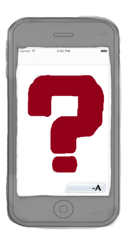
 I went onto photoshop to roughly design what the cards could look like. I wanted the card to be an actual iphone template in order to relate to the TV series, and I also changed 'Community Chest' to 'Community Coffin' to relate more to the show. In our group of 4, each individual explored designing something different, for example the actual board, the logo, the money, and the cards. By roughly trying out new designs we are able to put our creativity together for next lesson with the planning of the game. 
   These are good experiments because it allowed me to merge together multiple ideas to see if they work together, however I think it would be a useful thing to use not just an iphone, but experiment with the phone, using different brands etc.


Taxonomy Of Logos.

Logos

Logos are a symbol for businesses, they have immediate responses with audiences and effect the way we see both the business and product. They are vital if you want to capture an audience and allow them to remember your logo. Having a memorable logo is a key element to a successful business or industry because it means it will stick in people's heads, meaning they will remember your brand by your logo. They carry so much significance that the task of creating a memorable and suitable one is vital for a company.
   When creating a logo it is best to go for simplicity over complexity, this way it can make the logo easier for advertisement purposes, and also the most simple logos are sometimes the most memorable.


Here is an example of a simple logo that the majority of people will be able to recognise as Target. The name of the shop and the logo link together perfectly, therefore the simplicity of using a red target sign means the name of the shop will be easy to recall by looking at the logo, and the logo itself is so easy to remember you don't have to think about what shop or brand it could be.


 Here is another example of a logo that can be remembered all over the world, apple. Again the simplicity of having a black sleek apple for your brand means it is easy to remember the name of the shop and it's simplicity and like ability is what people pay for when buying apple products as they don't just buy the items for the product, they buy if for the brand.


  In addition to the fact brands and businesses need logos to be suitably created and professional, it is also important for artists as they can show their creativity and skills through the creation of a logo. It allows them to get across a message in a creative fashion, whether that be to make it memorable in a different way to obvious logos such as apple, or to be creative with the use of colours and fonts to reflect the business.

Different Types

  When exploring the different logos around us in shops, we went out and gathered different types of logos that we could see, some consisting of abstract, pictorial and text logos.


These are examples of abstract logos. They are based on shapes and can include text, for example like the image between the words 'Tommy' and 'Hilfiger'. They are simple, independent and often iconic.


These are examples of text logos, the typography differs, however they are adaptable and simple yet distinctive to recognise


Lastly, these are the examples we came across for pictorial logos, they promote the brand culture and are also easily recognised and remembered.


Friends Film.

Shots In Film

 In todays lesson we used shot types in order to create a small sequence. We had the task to include the 3 shots Wide, Medium and Close Up with a maximum of 5 shots. We decided to go outside and have the idea of two friends meeting, talking on a wall then leaving, we chose this because it would allow us to use the different shot types to show emotion on the characters faces.  
    We got shots from either side of the characters talking as well as them walking to and from the location, this wide shot allowed us to set and show the location in which the film is located.


These examples show the two characters walking to the set and away from it, indicating the beginning as well as ending to the film, this also links and ties the while film together, showing consistency throughout.


The next shot we see is showing the characters from the front using a fairly medium shot, this was to indicate that the characters meeting and showed their interaction with each other.


These two screenshots show the over the shoulder shot types we used but in different positions. For example in the first picture the camera focuses on the character furthest from the camera and visa versa.


In this image you are able to see more of the characters faces and emotions, however it is not a close up of either characters, this allows the audience to see both of them interacting together in the same shot.


To conclude, we tried to get the necessary shots and edit it together to have consistency and good flow, whilst keeping it roughly 60 seconds long. Next time if I were to do this I would like to make the shots where we are having a conversation blend better together and perhaps change the angle of the shots (slightly lower down or higher up to how hierarchy) to change the film and make it more visually entertaining and interesting to edit.


Advert Analysis.

Memorable Adverts

 The advert I chose to analyse was the advert for John Lewis at christmas in 2012. This being because the John Lewis advert is one that is much anticipated towards the end of the year heading into christmas and this is what I remember when I was younger. There are many factors in which make an advert memorable, some adverts are short and to the point, others could have nothing to do with the product they're selling, however the creativity mixed with the idea of the product can make an advert a memorable one.
   This advert in particular uses audio in which relates to the narrative, as it shows the male snowman trekking into the busy town to the shop John Lewis, to get the female snowman in the 'relationship' a gift for christmas morning. They have made the story somewhat relatable to all audiences, as the meaning of this applies to everyone getting gifts for loved one around christmas. As the snowman is shown moving and getting closer to the shop, the music also builds.
 In addition to these points the emotions in which it will give the audience can vary, however typically they tend to be emotional meaningful adverts that the audience can relate to on a personal level. We can see the joy in which both snowmen receive after the gift has been handed out, as well as the child at the end when she wakes up on christmas morning, showing her happiness and excitement, again an emotion the majority of children go through.

    The John Lewis advert is also an advertisement in which people look forward too as mentioned previously, therefore they have already built an audience which look forward to their new advert. In particular the song in which is incorporated into the advert normally becomes very popular,  also another reason as to why the advert is memorable to me in particular. In a lot of adverts, the product they try and sell normally has a 'theme tune' or song that is related to the product, making it memorable to us, for example the Haribo song.


Wednesday, 2 November 2016

Marketing Mix.

The 4 P's...


When looking at your target market you come across Price, Promotion, Place and Product. All four of these sections including vital questions in which a business needs to look into when creating a new product to put on the market. 
  Here is my example of answering the vital points, using the product of Dr. Marten shoes as an example of a product:


Target Market-     Dr.Martens


Product-
  • For the product the customers would expect good quality, durable, long lasting shoes in a variety of sizes, colours and variations. They are used for outdoor use in different weather conditions, they are branded with a label at the back and they all have a distinctive, easily recognisable look.

Place-
  • The shoes are available from a variety of shops such as Office, Size and are available in smaller varieties from other shops such as Urban Outfitters.


Price
  • The price for the final product would range typically between £80-£100. Depending on the type of shoe as well as the material and finish on the product


Promotion-
  • Promotion for the shoes can be done through tv adverts, facebook ads, billboards. By advertising through social media allows a range of audiences to view promotions -for example sales- and new coming products. The best time to promote new lines and products is typically when the new seasons are coming up


Organisational Tree Of Hierarchy.


The Logistics


In the film making industry there are a number of things needed to be taken into consideration before the filming process even begins, these can be seen in this blog post here. This post consists of the the hierarchy in a basic film crew, starting with the executive producer, working down to the electrician. In the lesson today we listed as many roles that we could think of in which we involved in the film making industry, ranging from the producers, to chefs for catering and feeding the actors, to the location scout whom find the ideal location for the film to be recorded in.


 Here is an organisation tree of the crew members involved in the process, the executive producer being at the top as they are in charge of ensuring the film is done on time, done within the budge and to agreed artistic and technical standards. This role is followed by the producer who has an overall control on every aspect of a film's production. They bring together and approve the whole production team. 
As we move down the tree we can see the role of the director of photography -or cinematographer- they are responsible for making artistic and technical decisions related to the image. Lastly we can see the roles that are nearer the bottom of the tree, such as Make-up artists, although these are vital roles for a film they are not the most important job roles in comparison to directors etc. They are required to to apply makeup to the actors in order to make them look appropriate for their role in the film, pulling together the more artistic side of film production.

After reviewing all of this it is clear to see that there are potentially hundreds of different roles and jobs in the cast and crew of film production, only to mention a handful of the key people above, however they all hold a key element which contributes to the film, whether that be in pre production, production or post production. Below is a clip from behind the scenes of The Hobbit, it shows the importance of all the roles involved in the production of a successful film.


FMP Showcase.

To complete this year (and the previous year) off we held a showcase in the Apex Hotel in Bath. This finished off the final part of my FMP a...