Sunday 10 June 2018

FMP Showcase.

To complete this year (and the previous year) off we held a showcase in the Apex Hotel in Bath. This finished off the final part of my FMP along with my final part of college and my course/time here!
 This was a really nice idea as it allowed us to put our last creative spin on the year as we needed to produce some banners to go along side out table when presenting our work. With a template made we then got to adapt our banners to our own styles, adding in images and captions of work we have produced throughout the two years here.
 I think this showcase was a really good way of ending the year, not only for us students creating the work and reflecting on it, but also the up and coming students/ those int heir first year at college in a similar course! I spoke to a couple of people in their first year and they all seemed very interested in my sketchbook work along with my online work, I think it was inspiring for them to reflect upon as it gives them ideas and inspiration to continue with their study! In addition to this it was really nice for parents to see the work we have done all combined into one evening!

 The apex hotel was a really good location in my opinion because it is only a short walk from college and almost separates the two, I would feel as though having it in college would make the evening have a whole different 'vibe' - a more school, parents evening type thing which I personally wouldn't like. 


 When reflecting on the work I presented I decided to use a mixture of fop work, sketches and photographs in order to capture the audience and show the range of skills I have picked up since being here at college and the type of things you are able to create. 
Overall I would say this showcase was successful in all areas, inspiring others whilst pushing us to get over the last hurdle of college before we all leave for uni or work.

Wednesday 9 May 2018

Evaluation.

Deadline
 As the finishing date for my FMP comes round the corner and having evaluated every individual thing I have completed in previous blog posts (Website, Final Designs, Advertisement Poster & YouTube Banner) it is now time to do a more rounded evaluation of my whole journey and project from start to finish.


Beginning
 So as the time for FMP came round I was more than ready to begin creating and getting my creative ideas down. We were given the brief for this year and that is where it all began. From day one I knew I wanted to create a product and digitally market it in some way. The reason for this being that my aim is to be able to get into university and study Digital & Social Media Marketing or undertake an apprenticeship in that field, therefore by creating a product and really looking into marketing strategies it is a key interest of mine and can also get my knowledge higher than it currently is!
 So for me I wanted to produce some products and sell them in some way, sounds pretty easy and also fun. After much deliberation and many ideas I decided to create three makeup based products, produce a marketing campaign / advertisement for them, and I would do this through building a website, creating a YouTube advert, making a large poster to fit in something like a bus shelter, and also a business Instagram account.

Strengths
 Upon reviewing my final products I decided to analyse them and my work and list 5 strengths and 5 weaknesses I can see in my final products!

  1. Strong in research - my in depth research can be clearly reflected in my final products, it is clear that I had my target audience in mind at all times and that is my priority throughout the whole of the project.
  2. Consistency - throughout all of my final designs and elements in my final major project you can see the theme is consistent, whether that be backgrounds, colour themes, or marketing techniques, I believe they are all easily recognisable to be linked together and this is really important when producing a brand.
  3. Quality - by only sticking to three individual products it allowed me to be creative but also keep the quality high. Three products means I could separate and designate my time to the individual products as opposed to rushing to get a whole collection done that I wouldn't be 100% proud of.
  4. Style - when reflecting on what my demographic gravitate towards and what their preferences are I believe that I produced products that have style, they aren't too intricate or give too much away, yet they still peak an interest to potential customers.
  5. Coherent understanding - this point I wanted to make is that throughout my journey to making my end results I have had a clear direction I wanted to head in. My experimentation, planning in pre production, production and post production and constant referral to my questionnaire results and focus groups has enabled me to constantly have a clear and coherent understanding of what women ages 18-25 that are interested in makeup specifically are looking for. The gap in the market was very narrow, but by collecting specific results and ensuring I stick to exactly what my audience required I was able to reflect all of this throughout my blog posts, screen casts, experimentations and finally in my three products and website!
Weaknesses
  1. Simplicity - although this is one of the main features my target market specifically gravitate toward and requested, personally when reflecting at my products and the amount I have done I feel as though it really is very 'bare' and considered 'simple'. Quality over quantity is something I strive to achieve and at the beginning of FMP I needed reminders, I had so many ideas floating around that I wanted to create but I also wanted to make really good quality ones I was proud of, so when it came to asking my target market what they thought of the products they chose the more simple ones, which opens my mind space to "perhaps create more content".
  2. Challenging enough? - I sometimes question the level I challenged myself this FMP, although research wise I over achieved and produced a large array of work I am very pleased with, I feel as though production wise I could have added some skills. I watched multiple tutorials (such as clipping mask creations etc) in order to create my products, however I wish I looked into making the 3D digital versions I discussed, if time hadn't run out. 
  3. Detail - For me I think I didn't necessarily 'not go into enough detail' however in my planning on paper I talked about adding things onto my packaging such as 'use before' 'cruelty free', 'recyclable' and things of that nature. When it came to it I felt as though when I added some of those features my packaging became a bit 'tacky/unprofessional'. I couldn't find the right balance when it came to size, colour, font, image layout and thickness etc.
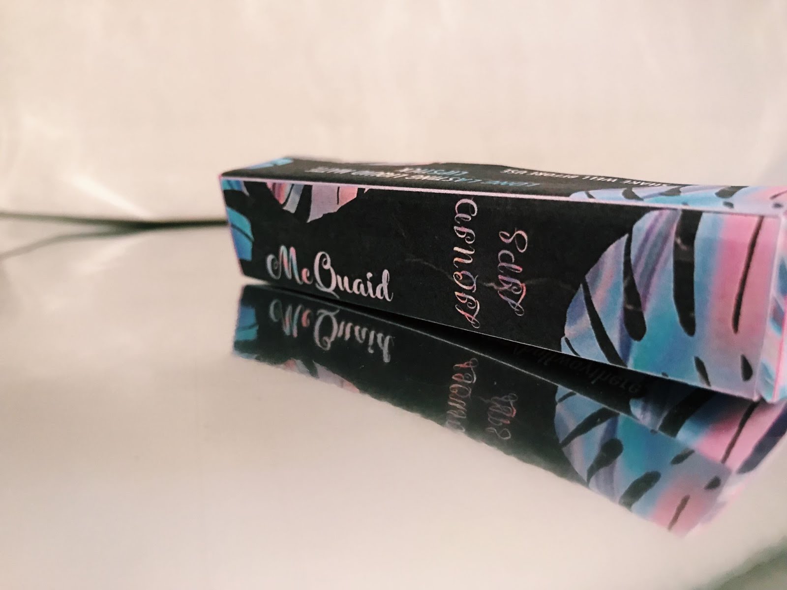
  4. Printing - one of my main weaknesses that I see in my overall FMP is the printing issues I came across. Initially I wanted to have my products printed professionally, including hot foil stamps, holographic material and more, but when it came to the quotations this become near on impossible. I then decided to overcome this massive hurdle and request free box samples from multiple business (to which they happily agreed) and unfortunately they weren't reliable as they still haven turned up and were ordered more than month ago. I wish I had come up with a higher quality solution sooner so that when it comes to the end of year show my products can be printed professionally as opposed to on average paper, as it doesn't give the final effect I wanted it too which was really disappointing for me.
  5. Physical - a weakness in my final products was mentally and physically a challenging, due to some circumstances my work load became increasingly harder to complete under my time scale, something not under my control, regardless I was just slightly disappointed in the fact I didn't get to for example go into some makeup shops and ask opinions on my products, or test print my poster and stick it to a bus shelter in town just to reflect upon. If I were given a second opportunity I think I would like to produce some more physical copies of my products, although on the other hand I did from the beginning state I wanted my whole project to be a digital 'thing' therefore I want to try not and be too disappointed in the outcome!

Main idea and influencers
 In this section I wanted to briefly touch upon my idea as a whole and what inspired me throughout. For me the idea of making a makeup brand and products was really interesting, it peaked my interest and also acme something I could enjoy. So my influencers for my project are primarily existing brands such as MAC cosmetics, Anastasia beverly Hills and more. I have gone into depth about my inspirations in my blogs as well as sketchbook as a lot of my research consisted of current competitors and not only they way in which they package their products, but the way they advertise.
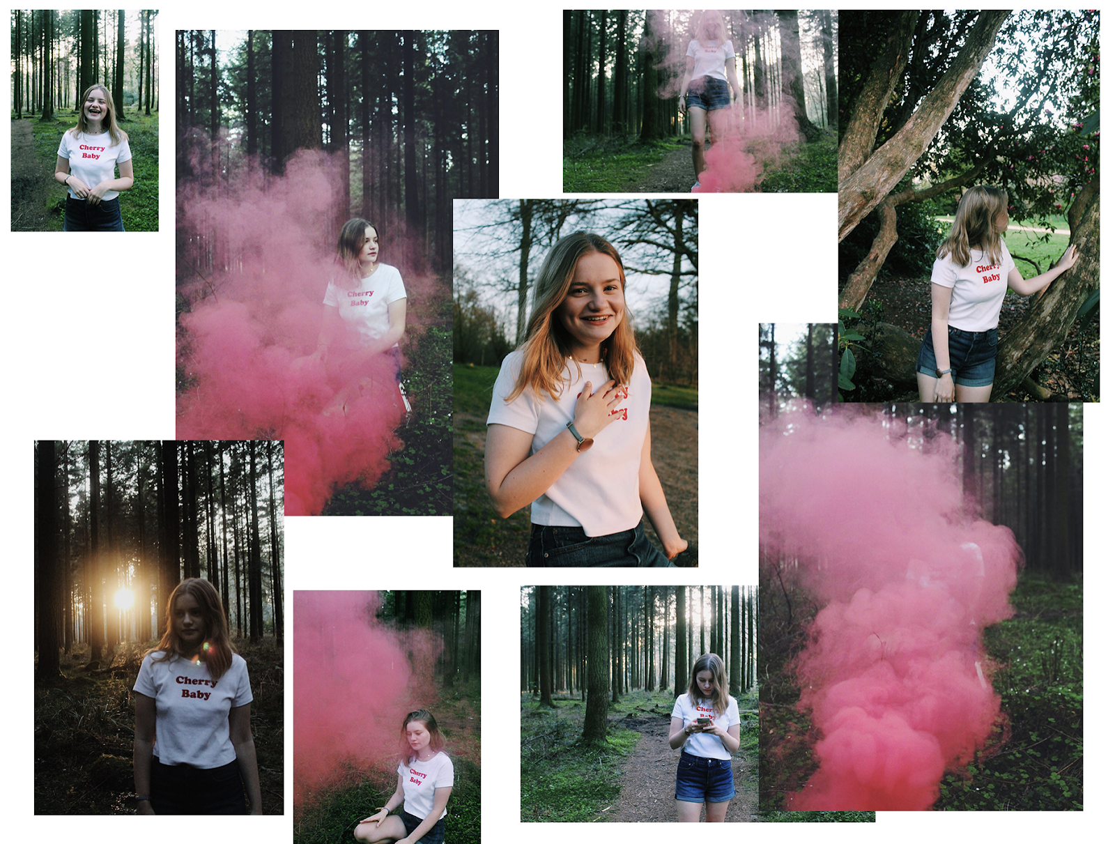
 When it comes to artists and the physical packaging inspirations I would say a heavy influence would be a collection of people. The website Pinterest has been an open tab throughout my entire project, whether it comes to colour palettes and individual photographers, or inspiration for ideas. For example when it came to my photoshoot I came across the idea when looking for potential backgrounds to use, I then was able to reflect on my work last year with a photoshoot I had undertaken and work from that! When looking at this photoshoot last year with the smoke pellets I found that the time of day and camera settings weren't ideal, and with only a few seconds of smoke it was something that could have been prevented if for example a test shoot had taken place.

Experimentations
 Another large part of my project has been experimentation with...

  • Font
  • Imagery
  • Layout
  • Colour
  • Texture
  • Photographs
  • Designs 
All of these elements I have experimented with have made my products what they are today. To go into a little bit more detail I spent a lot of time designing products, altering such small and minor details on them but also trying to include everything I wanted too. This process then was sent to my target audience to review and pick what they liked, didn't like, what they would change and more. I would then be able to take and absorb that feedback and apply it to my products.
 When it came to photographs I didn't want to keep it to a studio, I thought that would be too boring, which is why I did a recce and found some woodland area. I chose the time just before sunset so that the warm sun would be in my photographs but not glaring. I also purchased some smoke bombs online to add some texture and depth into my images. The justification for this was that as I didn't produce something like clothing, I didn't have the physical product to show as making a lipstick isn't as easy as it would appear. So I needed to add another element into my pictures that would not distract, but appeal to my audience for being a little bit different and experimental. On the other hand I could have taken the printed products on paper that I had stuck together and brought them out on the shoot however my reasoning for not doing this was because I already had a large amount of photos and digital images of my products, I wanted this to be different!


Development
 My development for my products was really inspired by all of my experimentation, it not only developed my products but it developed my creativity. My mind set was altered every time I was able to further develop and better my ideas, 'what if I added this' or 'what if I tried layering this' were questions I found myself asking every time I sat down at my desk. Every time I would create a layout, for example on my website, I would constantly be reflecting to existing websites, then back to my plan, then to my designs, and trying to fit them all together to make a smooth website that aesthetically was pleasing and fit my brand.
 Some key areas of development for me where the website along with my designs. I could see myself developing them till they reached a point I thought looked professional and hit a personal target. Speaking of targets I was constantly referring to my time scale management plan I created at the beginning of the FMP to keep me on track. This was effective for me however I did fall slightly behind as i'm sure everyone did. For me this was down to waiting for minor things such as questionnaire results, not knowing what to start first (having such a large amount to complete), did I have enough pre production work done before production and more.


Comparing


 For this section I wanted to give an example of media that already exists and compare it to my creation. Of course this doesn't have to be a literal comparison but I though it would be more interesting to compare and contrast these as opposed to a website of a brand that is actually real!
 So the mage on the left is an example of the brand Kat Von D and it is an eye shadow palette. I decided to choose this one to compare mine to because it was one of the brands and palettes I used in my research as was also a big inspiration throughout my creation process. Of course this palette is printed and professionally created so in comparison mine looks more unprofessional. However something I can see is the colours and simplicity of the two products when placed side by side. I feel as though there is little text used on both which is something I really like and think is effective. A clear difference I can see is that the title on Kat Von D's palette is 3D and you can see the texture it has, where as mine it just printed and looks a little 2d and 'boring'.

Showcasing
 When it came to having my final products completed it was almost a huge sigh of relief. Then to collect and gather some feedback from peers/friends/family was really nice as they got to see the end results and what I have been working towards. Producing a brand and products to sell within that brand took a lot more work and research than I think I anticipated, much like the website creation. I think I knew the amount of work I was getting myself into but not the large amount of detail and time they individually take, so by having a finished result and being able to show people it was really effective.

Changes and improvements
 This segment of the blog I wanted to consist of things I would change and things that have changed since the beginning. Firstly I want to reflect on my FMP pitch at the beginning of this project and seeing where I am now with my completed products. As I have briefly discussed here and in multiple blog posts I really aimed high at the beginning because I had some many potential ideas. For example something I was really keen on creating was an interactive app onto of everything I have created, in theory it sounded really interesting and would be really effective, however given my skills set and the time frame it would have been impossible. However in discussion with my lecturer at the time we discussed the amount of work I wanted to complete and what would be achievable, therefore reflecting there isn't too much that has changed since the beginning.
 The one thing I did talk about after realising an interactive / augmented reality app wouldn't be possible within the given time scale, was a mock up for this. In my blog post reflecting my presentation I ended up decided to make a mock up app and mock up website, then upon refection and undertaking my research I decided to make a proper functioning website and ditch the app idea as after all it would have been very similar to the website! I think for me a big thing I firstly focussed on was including interactivity between my brand and my target audience and I thought I would achieve this through an app on a mobile device. Something I didn't think too much of or consider was the accessibility of this app, I initially thought of a mobile app but then when I really looked into detail with the website I found that having the website on a desktop and mobile device was a lot easier.

changes...
I think this is also something I have most defiantly discussed in my weekly reflections and other posts but if I could change anything about my products what would it be? Well firstly I would have them printed professionally, so that the textures and background come into full effect. The whole holographic theme my brand has is somewhat ironic, the holo material is a material that is all about looks, reflecting and bouncing off light, but not being able to actually find anywhere that prints this for under £300 was impossible. I would alter my idea and perhaps colour theme if it meant being able to professionally print my products!
 In addition to this I would maybe look into the actual production of makeup, although this opens up a whole new kettle of fish and would rise cost, time and relevance... so perhaps not!

Statement Of Intent Review
My statement of intent was actually really interesting to look back on as I seemed to be really focused on the app and augmented reality side to my project as I quoted " by producing an app and website for my brand I am able to incorporate interactivity as well as a highly respectable looking collection of products that are desirable to the target audience"
 Changes that have already been mentioned above are of course the app. Not only this but I added in the Youtube advertisement along with the Bus shelter poster idea, which I didn't actually realise weren't in my statement of intent and were therefore added shortly after completing it. This was interesting for me to look back on as from my current point of view it seems as though having my products and app was all that I wanted to create, however when looking at my pitch and in my sketchbook/blog posts I mention a wide variety of other potential ideas.

Conclusion
To conclude this evaluation blog post I thought I was conclude my project and thoughts overall. At the beginning of FMP I was very inspired and motivated then as the research portion was coming to an end I felt a wave of disinterest. This was something that didn't really happen when it came to my last FMP, at least not to this level. I needed to push through this and continue with finishing off my research and begin my production portion. I felt at though if I had done some more work closer together it would have been more beneficial as opposed to having to take chunks of days off working on it. Although in the end everything was completed a day before the deadline I did plan to have everything completed properly around the last week of April, therefore was behind in my own terms.
The outcome of this project is that I have an array of digital products I am pleased with that showcase my skills and understanding to complete a digitally published piece of work to a high standard. I think if I had a larger budget and a couple more weeks I would have been able to produce a professionally printed group of products that would be ideal for the end of year show. Reflecting on this I think my project has been a success and I am happy with what I have produced, there are a number of elements in which I think I have thoroughly analysed in my blogs and my screencasts that justify my designs and the processes I have undertaken.


Instagram.

Social Media
 Lastly I decided to take this short blog post that reflect my instagram page that I put together. For me I use instagram for a lot of research and when it comes to makeup - such a visual thing- I decided the best docile media platform would be Instagram. This was just an addition to the list of things I created but I thought t would be nice to include on the website and advert posters! The reason for that being that my taggert market use instagram all the time, with the communication available having my brand on Instagram allows my target audience and customers to take, view pictures and look at things such as tutorials and new releases!


I decided to set this account up as a health and beauty business account, linking my website in the bio and keeping it all fairly simple. My picture is a more detailed version of my logo as opposed to just my name, and I've added some pictures to my feed which include my products and a photo form the photoshoot. 
 Overall I think this was a good idea to produce as it fits my target audience perfectly and is a good visual way to represent my brand on social media! You can follow the account HERE

Tuesday 8 May 2018

Website Evaluation.

Reflection
 I decided to create this blog post to showcase my website using some screenshots and justifying why I have made things the way I have! I have made a blog post prior to this showing my experimentation with WIX.
 The process of making a website is a lot longer than I had anticipated, I think the reason for this would be because when I last made a website portfolio I only needed to add my image onto the website and an about page, where as this time around I had created a whole brand and products that I needed to set out professionally. I needed to add a shop page, think about light boxes, transitions, what happens when you hover the mouse over certain things and more.

Slogan Transitions
Hover & overlay options...


  Something I decided to add to my website was a Spotify playlist that plays some 'cafe music'. Initially I wasn't going to have any music playing as I couldn't decide on the type of vibe I wanted to musically portray to my audience, therefore by sticking to something such as cafe music it allows customers to almost relax and perhaps not notice it playing, and are therefore less inclined to want to turn the music off or just shut the browser! This in theory I thought was a really good way to interact with the audience in a subtle manner, however upon reviewing my decisions and pin pointing my 'what went well' and 'even better if's' I decided to remove this. The reason for that being that you needed spotify in order to play the music and it also half showed up on a smaller laptop and look out of place!

 In this screen shot you can see the difference of the Home page on a desktop and a mobile device. For my logo I could't add it in and get it arranged the way I thought looked good so I decided to stick with a similar font and just have that on the home page. I think my site looks best on a desktop as transitions and some extra's are available on a desktop. When producing my site I knew it would look slightly different on a mobile device however I didn't think it would be a different as it is so if I could go back and adjust or alter some things I would try and find a template or way of arranging things that made it look a little bit more professional on a mobile!


 These screenshots on my iPhone clearly show the difference in layout, so I decided to insert screenshots of my desktop below to compare and contrast:


 The interesting thing for me was I was viewing the website differently depending on the desktop I was using. for the first screen shot on the left I used my Macbook, then the one on the right shows what it looks like on a larger iMac, which is interesting because the 'Half Way There' slogan didn't seem to appear at the time when I was completing this, however I can guarantee it is there!
 When creating this website I didn't realise how much technical work it would take for things such as layout to be done correctly, I think if you weren't looking into too much depth the website looks nice on a smaller screen however on the big screen you can see everything.


On a positive note I think I managed to incorporate my colour scheme and over all vibe I tried to achieve with my products and portray that onto my website without having it be too repetitive. I wanted to add some of my own images as you can see, however I have of course taken a lot more images but I found they didn't really work too well when 'bombarded' so I decided to stick to the more minimalistic side to things, as my demographic have clearly stated that is something they prefer.

 Relating this to my demographic and how throughout this project I have constantly been referring to my audience more so than last year it has enabled me to develop as  a person and creator. The audience are the focus in any project, so aiming to please them is the goal. When looking in to this it was clear to me - as you would have read in blog posts- that minimalism in particular is something that females ages 18-25 prefer and gravitate towards, I feel as though now a days when things are 'too much effort' or perhaps 'too intricate' people don't bother. I think my website is very to the point, it gives you information about my brand, the products I sell, along with images of the products being used, and in photoshoot like environments. Navigating around the site is simple, hence why I wanted to stick to very few tabs, minimalism is KEY.

Conclusion
 To conclude this blog post I think I would like to reflect on the journey I took producing this site and the creative freedom I had throughout the project as a whole. Being able to create a website how I want to portray my brand and my products was really interesting to me, I think I have created a well working and good looking website that does its job. Of course there is always room for improvement, if I had a longer extension for this project I would have liked to look into building websites, tutorials and more, in order to get the full effect of a really professional website. On the other hand this is all of course a mock up, my products don't actually exist which is why I wasn't too disappointed with perhaps the lack of professionalism. given my current circumstances I was able to produce something that anyone could look at and realise a lot of effort and work has gone into it.
 I am excited to see my new skills set after being faced with making my own shop website, it has made me put on a more 'business-like' mind set along with keeping my target audience front row of everything I produce.


Monday 7 May 2018

Focus Group - Final Designs.

Final Designs
 As the decline of May 10th comes around I decided I need to round off all my loose ends and evaluate my whole project. Firstly I needed to produce this very blog post that discusses the focus group I had a couple of days ago. I gathered some people in my target market to quickly answer some questions about my final designs and what they thought about them. I decided to ask three main questions to get the opinions across, and jotted down some of the more important and note - worthy answers as seen below!


 In this focus group I had brought along my mock up designs made form paper and explained my brand and whole idea and aims. The answers and overall response was very positive, I can see from a potential customers perspective it was hard at times to just focus on the packaging of the product as of course at the end of the day you buy a product for the product inside, not so much the cardboard it comes in! Despite this I think the responses I did receive really helped my project as it also allowed me to view my products from multiple points of view, as a designer, potential customer myself (as I fit in the target market audience) and also a customer who perhaps doesn't like packaging and the looks of things. 

As you will have seen in previous blog posts I have created posters and provided multiple screen shots from different angles of my products, however seeing as I had printed out and made my mock up that I would do a mini impromptu photoshoot with my iPhone and using VSCO to edit and out them together!


The material underneath is some 'holographic paper' I ordered from eBay at the beginning of this project that I thought I could potentially use for my mock ups, however as the designs got slightly more intricate and the paper quality not being the best I decided I could use it for purposes such as the above and in my sketchbook instead!

 Conclusion
 By conducting this focus group and allowing people to physically see some of my products was really effective. It allows you as the creator to see what you've spent so long producing, researching and planning and to then see the reaction from someone was really interesting to me. Keeping that in mind I think by gathering these results in a more informative way )as opposed to another questionnaire) I have thought more about my demographic. The justification for this being that females aged 18-25 spend a lot of time on social media, hence why the previous questionnaires that were sent out on social media were effective for my specific brand and the questions I wanted answering, however when it comes to physical products, verbal communication is the most effective. I think the reason for that is that when you answer a survey you feel the need to be formal and really think about what you're going to say in order for your response to have an effect, however when it comes to a focus group you can see their facial expressions and their first thoughts and opinions, especially when surrounded by others as it sparks things such as 'this reminds me of...' 'I could see this as the next...'. 


Wednesday 2 May 2018

Advertisement Poster.

Bus Shelter
 The initial idea for this portion of my production was to produce a digital poster that would be displayed in a bus stop. I looked into printing an actual sized poster however they were huge and expensive so what you see in this blog post is my digital journey to producing the poster!

 Firstly I wanted to make it different to my YouTube ad, I wanted to line the products up as if it were a photoshoot of the products! I lined them all up and included some greenery.


 Above you can see my final product, including the instagram name ( as by having the website URL wouldn't be effective on a poster - no one would bother to remember!-) I experimented with different leaves however I didn't want it to look too similar to the products packaging. I also decided to experiment with the paint brushes to try and get the effect of a lipstick. It took few attempts to find the right texture I was looking for however I was happy with what I ended up with.

 Once I had created the poster showcasing my products I decided to actually create a little mock up getting an image from Google of a bus shelter, just to show what it would look like!


 Conclusion
To conclude, this particular piece of production was just an addition to my other pieces of work, I wanted to show a variety of options and things I could create to market and sell my products, whether that be through social media, a website, YouTube advert or a poster! I think I have created a large array of work that varies in where the demographic would view the advertisements. I decided to create a bus shelter poster as I had in mind that my target audience often use public transport for work, school etc so by having it showcased at a bus shelter in town would be a perfect way to promote my brand. To justify my other reasons I would say that social media is the number one way to reach females aged 18-25, particularly YouTube as I found out in my LJ Hugs brief last year. It is a really effective way of reaching the right audience.

Tuesday 1 May 2018

YouTube Advertisement Banner.

Banner
 Since the beginning of FMP I knew I wanted to create a YouTube banner advert as part of my marketing for my products. As production for this FMP lasted longer than I had anticipated I decided that including secondary research for youtube banners would be best off in a separate blog post that I produced a while back (here) so that this post can curly be for the creation process and final outcome.

 When researching the sizes for my banner I decided to look into the monetising for content. This showed a variety of different banners and ads that were available to create along with information about them which was really helpful1. When looking into banners I needed to think about the type I wanted to create (for example I didn't want a moving image advertisement) and also how it would be viewed. As you can see in the screen shot only certain banners are seen on desktops, whilst some are on mobile and Tv's for example. The type of banner I wanted to produce from he start was an 'Overlay Ad'. This would be seen on the video as a banner you need to exit rather than having one on the side of the video.


 So what I decided to do was open up Photoshop and create a document the correct size (or as close to it!) in order to begin creating my banner. The adverts banners I decided to create are in fact only able to be viewed on a desktop computer.


Step 1


Step 2


Step 3


After I had looked at layers and positioning within my given space I decided to open up another document and experiment with added one of the images from the photoshoot as seen below:


 This was interesting to experiment with, I added multiple of layers just to see how colours and textures go together so it is a very busy example to show! I didn't like using the images in the end so decided to stick to the more simplistic advert as show above. However saying that I still decided to experiment just so that I can 'trial and error' different designs and layout to get the best one to suit my brand and products I am advertising!


In the example above I have used an image and place my products round it, along with advertising the '10% discount' in order to entice my target market. I have also included to 'shop now' text, although in the image you won't of course see it but if it were placed on YouTube it would be a link that opens a new tab / window leading you directly to the website!

 Conclusion
To conclude my youtube advertisement banner I would say that it was a very simple and fast piece of work to do as of course it needs to just be a simple engaging advert to try and attract my demographic to my products. I keep to the same aesthetic and images that were used in my products production as well as my website, keeping everything connected.


1: https://support.google.com/youtube/answer/2467968?hl=en-GB

Final Designs & Final Experimentations.

Designs
 After producing multiple digital mock ups ad a physical mock up of my product, it was time to finally produce the final versions of each product. To do this I decided to make each individual item (on Photoshop) and then make a net design of each item and what it would look like. Before I began the final products I had some font to add to my products of course which was something that needed some trial and error. I wanted to make my logo and overall design link up to the rest of the writing on my products, however I didn't want it to blend in and all become one.
 Below you can see some screen shots of my eye shadow palette and the change in colour and background of the name. Again like my logo I wanted to incorporate texture into my name so I creating clipping masks of some images, one of which included the smoke from the photoshoot.


Pink smoke used as clipping mask


Same image as logo and leaves 


Image used for background of website used for name of palette

My favourite one would be the last because of the way I incorporated the image that links to the website and it also incorporates holographic theme, keeping it all linked together to have consistency throughout. I have inserted below some screenshots of my netting in progress, using specific measurements in order to print them out and make physical mock-ups. 


I decided for the 'flaps' of my products packaging, rather than having them plain black I would put the holographic photo that I used as a clipping mask for my logo, again to give the product some consistency as well as some more colour and interest to the packaging.
 

Final Designs
 Once I had done some final tweaks to my packaging I was able to fully complete al three products (Lipstick, Eye shadow & foundation). This happened later than anticipated when looking back on my time scale, however moving positively forward it now means I can produce my mock up photos for my website, poster and YouTube Ad. I think when it comes to the YouTube Ad I will use photoshop, but to present my work I want to perhaps try and incorporate it into my website as an image that is mocked up to be an advert. The issue with my proposed YouTube advert idea is of course I cannot pay and make an advert for a brand that doesn't really exist. 


PhotoShoot Final Images
 As briefly shown in my BTS photoshoot I briefly played around with the images I had taken, trying to incorporate some holo into the images in a doodle way! This for me was unsuccessful as it didn't give me the overall aesthetic I wanted to achieve so I therefore did some more experimentation as seen in some screen shots below:


These images were really fun to experiment with using a variety of images curtesy of Google, to give some texture to a photo and some more depth. These are the types of images I want to have dotted around my site as the colour of the smoke in the foreground along with the tress in the background relate to both the colour of my products themselves as well as the packaging. For some it may be easy to perhaps see no obvious link or correlation to my products however when I was researching existing beauty websites 8 out of the 10 sites I explored featured photos of models in perhaps an 'unrelated scene' BUT they showed the type of person to perhaps use their products, the setting often reflected the product of the brands ideas and inspiration etc. The direction this has taken me has allowed me to add some real photographs into my website and production process as I have now created my digital versions of my products!

 I also decided to quickly produce a little collage consisting of some of the images I will be using, and ones that I couldn't fit in to my brand and direction specifically but I thought it would be worth adding into this post to show my experience and direction my final project has moved to. I knew the time and aesthetic I wanted to achieve with this photoshoot, however with things like this it's also orate trying some shots even that aren't planned just incase they can be relevant, or even if they're just to experiment with!


Conclusion
 As my production has come to a conclusion I can now move forward to creating a blog post showing my website and then also begin to look for way to improve my work. I have in fact done a focus group with peers that are in my demographic discussing my products and website and any possible improvements which will be discussed briefly in a blog post to come! As of right now I need to go back on my timesheet and update everything adding links to my own spreadsheets to get everything organised and easier for the markers to view my work!

Weekly Reflection.

Production
 Upon reflecting from my last reflection blog I have made a lot of progress in regards to moving forward with my project and 'get the ball rolling'. Once I had received my questionnaire results about my designs I was able to kick start the production of my final designs which then allowed me to see the overall aesthetic and 'vibe', consequently allowing me to begin the production of my website and more.


 The website creation part was by far the most interesting for me. At this time I hadn't had my final results and created any mock ups that look like how the real product would so I was just at the point of choosing templates and adjusting the pages and layout. I went through two templates and styles before I ended up with the one I have now, and I also needed to adjust the individual pages, including sizing, tabs, buttons and more. At this current moment I have produced my final designs which can be seen (here) meaning I can now insert them to the website. Once thing I really want to do in addition to this is when it comes to adding photographs of the products online I want to try and include some swatches or something extra rather than one image. I am also going to have a look about creating a 3D image to put on the website in the 'Shop' menu as this would make it more realistic looking. 


 As I have discussed in a blog post, when looking at my template on WIX I wanted to include some of my own images. This meant undertaking a photoshoot, I had the place time and date planned, along with a model and some 'smoke bomb' props. I wanted the images to be free flowing, I wanted them to express happiness and confidence without having a typical 'head shot' of a model with some eye shadow and lipstick on! By having mine in the woods around sunset time on a warm evening you can really tell the overall vibe through the pictures. I also contemplated bringing some material with holographic- like features to put in front of the lens to give a 'flare' like effect, however I couldn't find any with the qualities I wanted, therefore I will experiment with this on photoshop! 


Reflection
 When looking at time scale and what I have left to do, I think it will be a push however it will be done. Realistically I need to...
  • Edit some photos with some form of holo merged into them some how
  • Create a photoshop document that lays my products out in a way that makes it look like a photoshoot had happened
  • Upload images to website and write description
  • Produce YouTube advert banner
  • Produce 'bus shelter' poster
These are all tasks in which will be time consuming however once I begin the edit I will be able to go through my tasks fairly quickly I think!


FMP Showcase.

To complete this year (and the previous year) off we held a showcase in the Apex Hotel in Bath. This finished off the final part of my FMP a...