Wednesday, 14 December 2016

Different Directorial Styles.

Styles

Every director has an original way of shooting a film,  however it has been a controversial subject since 1954. Each individual film would represent the individual director and their creative personality. 

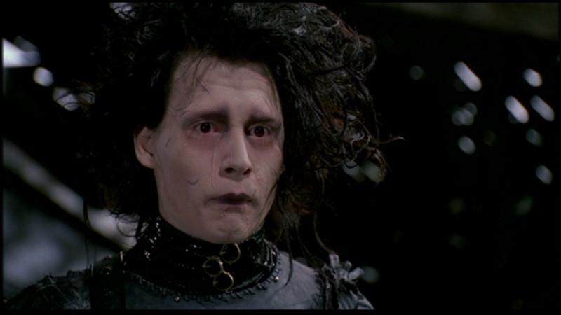
 Tim Burton 

  Tim Burton has a very distinctive visual style, he also has unique production designs. In every Tim Burton film it is clear he sticks to a g
othic colour palette, in both production and costume. Films Tim Burton directed vary from The Nightmare Before Christmas to Alice In Wonderland, all have reoccurring themes, characters and characteristics.

Wes Anderson

  This director has again has a very original style and you can spot this very easily. He again like Tim Burton has a distinct colour palette. He adheres to a set that has great detail, in regards to shooting he typically keeps his camera stationary, preferring to shoot his scenes in straight-on fashion. This however is avoided by a lot of directors as it prevents the scene from having a three-dimensional feel. Anderson prefers this however because he prefers it to feel and look more like a painting than a three-dimensional moving image.


Terrence Malick 

Lastly, this director is well known for shooting such a large amount in 'magic hour' this being the hour before sunset and hour before sunrise. His films typically use natural light with handheld footage and muted colours. Malick's films often dwell on the struggle between man and nature. 


       Comparing these three directors is interesting because they all have individual aspects that make their films individual and differently creative. For example the contrast between Tim Burton and Terrence Malick is particularly interesting as Burton uses dark, gothic colour palettes and alot of make- believe characters and effects, and on the other hand Malick uses the majority of natural light and natural concepts between nature, earth and humans. These are good to keep in mind when thinking about the films we will be creating, for example when thinking about shots, I can do research on films by directors such as Terrence Malick and the 'handheld' camera concepts as opposed to a more stable camera shot and angle like Wes Anderson.

Thursday, 8 December 2016

Audio Production.

Entertainment Podcast

After undertaking research from previous podcasts (here) I then was able to produce my own audio podcast using a microphone. As mentioned in the previous podcast I done an 'Entertainment News' podcast regarding celebrity news. After I had recorded it, ensuring the audio levels were level, I continued to edit it using Adobe Premier. I found some music off YouTube Library, again as discussed in the previous blog, so I merged this in with my own audio, do give it a slight 'jingle' at the beginning and something to hear throughout. I lowered the audio gain on the music slightly, and done the same with my recording of audio ( setting the gain slightly louder) to make the music flow nicely in the background and not over power the audio.
  In relation to the research I did, my podcast includes a jingle and one person talking, the majority of podcasts I looked at in particular ( entertainment) included either one person talking with video evidence to match the news article, or more of an 'interview' style.


I included relevant audio (pop) to link to the audience and target market, I also made it just over 60 seconds long, so ideally I would have made it longer, however I didn't want to have the music playing for too long either before or after the report as I felt it was unnecessary. 
  Here is a link to my entertainment podcast:


https://drive.google.com/file/d/0BzdSz8iKJ1WhX0VNOGpHTkpuRUk/view?usp=sharing


Tuesday, 6 December 2016

Motion Tween,Shape Tween & Character Waiting.


Motion Tween


In today's lesson I created an animation of two cars using motion tweens. This is a easy way to animate an object and is simple to do. Firstly you need to create your object, secondly right click and 'create motion tween'. Once this has been completed you need to click on the last frame in the timeline and drag you object to where you want it to end up (the path it will move in).
    After this was created I decided to add a second car to the animation, this makes the animation more interesting and was good practise.


Shape Tween


To create a shape tween I drew my initials out using the brush, then inserted a keyframe at 10. After this I drew straight lines on my initials and selected a time inside the 10 frames, right clicked and added 'Shape tween' consequently producing the gif below.


Character Waiting

 Lastly I made the character that I previously created (here) and made it 'wait'. I did this by making her blink and slightly move, after I did this I decided to make it snow, just to add some variety to it and make it more interesting to watch.


Santa Cartoon


Merry Christmas: This animation was interesting as it was different and original, I would say it isn't specifically for young children, despite this I like the take on christmas / santa.

Santa's Workshop: This was a very good animation to watch, the use of music, repeated shots and general happiness was enjoyable to watch. There was a clear use of symmetry and by using the repeated shots it saved time.


Monday, 5 December 2016

Animated Characters.

Creations

 In today's lesson we were given the task to create a new character (human, pet) in anticipation to later animate them in Adobe Animate. I wanted to create an animal/ thing that is out of the ordinary, consequently created the monster below I did this using photoshop.
   I gave 'Cecilia' the colours of deep teal and brown hair, this was because the character is 'classified' as a monster, however not a scary one (colours red might convey evil...) so I decided to go for blue, green tones and brown hair to keep it neutral. Some have said it reflects a 'Monsters Inc' vibe, which is good as that film contains monsters that are friendly (we see a different side to them). My monster has her arms behind her back, showing she is fairly relaxed and content, below you can see the different point of views of my monster, starting off with the initial sketch, then to a more simple, easier version to animate later on.


Wednesday, 30 November 2016

Recce In The Crescent.

The Royal Crescent & Circus

Today we went to the Royal Crescent and the Circus in Bath to hunt for locations for a Period Sci-fi, taking into consideration a list of things ( as listed here ). We explored and were able to review sunlight as the main point when thinking about filming, sun rising in the East and setting in the West. These points are important because we are able to know which directions to face the camera to get the desired effect and aesthetic.


   From this point of view we are able to get a good view of the crescent as well as the surrounding grass, however in addition to this we can film from a more direct angle at although the sunlight would be very powerful, it enables us to get a silhouette of characters or the trees and surrounding area. 


For example this image shows the angle that would allow us to film good silhouettes. 


   This last example shot shows how shadows can effect the aesthetic of a shot, from this angle we also cut out the road and cars, meaning it would fit with the period time frame and therefore could be suitable.


Talking about what is suitable for a specific time frame is very important, we discovered many issues along the way such as graffiti, cars, blinds in windows,satellites on roofs,signs, flat buzzers. If we were to film in a location like this these things would have to be removed and altered in order for it to fit the time period.
  Lastly we went to the circus and found a good area that looks down a street as shown below. This would make an interesting shot however in regards to our specific period sci-fi it would not be suitable due to the cars and any flat buzzers that were visible.


Board Game Peer Assessment.

The Purge Game Review

 After playing and over looking the game The Purge I can clearly see which points successfully meet the brief and product guidelines. Firstly the aesthetic of the board game successfully portrays 'the purge' this including the colour scheme and choice of imagery used on the instructions and board itself. The game had clear product identity and I was able to easily identify what the game was based on (the film the purge) this was clear to me through not only the name, but also the imagery used, like the use of american flags, anonymous masks etc. In regards to colours, they were quite dark, the use of blood splats were also placed on the instructions and this added to the aesthetic of the product. 
   By viewing the prototype and being able to properly see the physical game I was able to identify which points would work better than others. They had not yet printed the moving pieces out so consequently had them replaced with paper, by doing this we were able to play the game,  however I noticed that after rolling the dice, the numbers on the board were not as clear as they could be. I personally found the font too small, however this did not make it 'impossible' just harder to see where exactly the pieces should be placed. The overall idea of the game was that when you rolled the dice and moved places you then picked up a card in which had weapons on, the player with the 'highest' or 'better' weapon was consequently the winner. I liked this idea and the 'rank' of each weapon could be found on the instructions. If I could add to the constructive criticism I would also argue the fact that perhaps those playing the game may not agree with the ranking of each weapon, i.e is a bat better than a knife etc. 
   On the other hand I liked the simplicity of the game, it was very easy to play and the rules were made very clear, this meets the points on the brief and also allows different target audiences to play as there would be no 'limit' that would necessarily make it difficult to play, however of course the game is based upon violence and weapons so it limits the game to those would can play it. In regards to the actual game I did not find any of the pieces hazardous or harmful in any way, again making it meet the brief successfully and is safe to play.

  To conclude, I think the game The Purge was a successful board game because it meets the necessary specifications in which are listed in the brief, it holds a lot of originality and is easy to play. I liked the colour scheme as it adds to the aesthetic and idea behind the game, it also shows clearly the type of audience it is aimed at. In addition to these points it also includes elements that are in original games such as playing pieces and cards, it does no exceed the international paper size of A3 and over all I would happily purchase this game to play.

Monday, 28 November 2016

Symbols & Instances.

 Symbols and Instances

 A symbol is a graphic button or movie clip that you create once so that you can re use it and modify it throughout your documents. When I created my new symbol ( the penguin ) I dragged it into the timeline and began to create and insert key frames within that layer to create semi-moving ( an attempt at) penguins. I was able to alter the size of the penguins and make them slightly move on the ice. I only create a small animation gif as I am still getting used to symbols and instances within the library.


You insert a new symbol into your timeline, then draw the symbol of your choice (penguin) and this will appear in your library, from there you can drag it into your layer and begin the animation.


Here is a screen shot of when I inserted the penguin, the screen shot below shows when I altered the width and height slightly of the penguin, showing that you can alter symbols to how you want them to look.


The finished gif.

FMP Showcase.

To complete this year (and the previous year) off we held a showcase in the Apex Hotel in Bath. This finished off the final part of my FMP a...