Monday, 18 December 2017

LJ Hugs - Instagram Feed.

Running theme
 This visual I decided to produce a mock instagram feed which showed the layout and also colour theme I would want to have. what I initially had in mind for this was high quality pictures with some darkness and shadow but also with enough colour to grab people. I want to have a subtle 'grain' effect and also include pictures of the shack, food, chefs and products.


This mock was created in photoshop and I used a variety of photos form LJ's website and also my other mock ups such as the stamp card and £5 Friday advertisement poster. In regards to colour scheme I want to have the pictures have a very similar colour to the ones above. What I did was I imported my photos to 'VSCO' the app and then added some filters, adjusting the brightness and also adding grain, giving the desired effect. Then for the actual colours I will keep the mustard / light yellow colour as well as the baby / ashy blue as I think this looks really nice agains the darker photos!


Above is a screen shot of the pictures once I had edited them the way I wanted.


LJ Hugs - Advertisement Poster.

Poster
 For my next visual I decided to produce an A5 poster advertising his stamp card (here) along with £5 Friday and also an additional 10% student discount. I decided to keep the theme of muted yellow and also the font to be in the style of handwriting. This poster would subtly advertise LJ's Friday offer of £5 for a meal as well as the student discount and also shows the visual of the reward card and what you can get from it!


for the layout of this I wanted certain aspects of the poster to pop out, for example the 10% student discount and £5 Friday! I decided to add my logo that I redesigned too, however I feel like the writing doesn't go as well as I thought it would when I layered it on top so if I were to do this again I would want to make the font on my logo pop a bit more (make it easier to read) and perhaps just make the pen thicker. In regards to the back of this poster/leaflet, I decided to try create a poster showing an image of the stall and the '£5 Friday' written on it, as shown below:


Design 1


Design 2

I think by incorporating hand writing and a variety of colours and images gives a really friendly atmosphere and vibe, more 'homely' so this is why I heavily relied on hand writing everything rather than downloading a font. I think having the writing this large makes it stand out and makes you want to read further into the leaflet. However if I were to do this again I would want to try and find a nice balance of the colours as currently I feel like the font doesn't stand out as much as it could at the moment.

Sunday, 10 December 2017

LJ Hugs - Marketing Strategy.

5 P's

  • Product
  • Price
  • Promotion
  • Place
  • People
Product- The product LJ is promoting is street food, the 'product' I want to promote is him and his business. Included in this I will also promote his website and social media platforms, along with some of his food and unique seasoning. This will be done through a re-vamp of his social media and overall advertising strategy, for example in magazines.

Price- The price of my marketing strategy depends on how and where I advertise LJ. After performing some research on Crumbs Magazine (specifically Bath & Bristol) I found a chart with prices it costs to advertise in their magazine based off of 2016, as seen below.


Promotion- This is the key part to this project as I will be promoting using Instagram, Facebook, Youtube and also crumbs magazine. I will produce advertisements on the social media platforms to promote his stall, his menu and his offers.

Place- The place in which these advertisements will be seen is in and around the city of Bath. The reason or this is that his main stall is there, and at the moment as he isn't branching out further, I would see it as a little bit pointless to promote him in, for example, Wiltshire or somewhere far away where people will most likely not want to travel for an unfamiliar place. 

People- The people I am aiming this at is the younger demographic, such as teens in college and young adults in the working industry. Although I'm advertising his business everywhere for all to see I particularly want to get the attention of youths. This will be done by using particular social media sites, then for those above that target market age, for example older people working in Bath or chefs, they will see the advertisements in 'Crumbs' magazine and also in and around Bath (stickers, posters, leaflets)

Thursday, 7 December 2017

Reflection - Typography project.

Week 6
This week the lights arrived and we had all the materials that we needed, so we were able to begin properly begin disassembling the palettes. We separated the slabs and removed all the nails, along with measuring the wall and ensuring the palettes were the correct height and width.

Finalising
 After the christmas period we came back and had our 'canvas' to work on. The palettes were mounted on the wall and we had wire and tie wraps to attach the lights to in order for us to be able to manipulate the lights into words. Before we did this we had a group discussion regarding the quote itself and we decided to change it, so we individually found a quote we liked and voted on the class favourite, my quote was "An essential aspect of creativity is not being afraid to fail". We then voted and chose the quote "Don't stop until you are proud". Once we had changed this we then got into pairs and created a word each. Lola and I made 'you' then later helped other groups.

 The finished product wasn't something we were completely happy with due to lack of communication, one word was in capitals whilst the rest was in lower case. So we decided to change this as seen below:


 from this we were able to critically analyse our work as individuals and as a group too. This project required a lot of research in regards to equipment, and also a lot of work when we decided to break down the individual palettes. We were able to stay as on time as possible, however with time slots in college and availability we tried to be efficient in the two hours a week as possible. The finishing outcome looks really good with the lights turned off, the lettering looks hand written and is clear to read. We also thought that the colouring was really nice against the wood in the classroom.

Overall this project was a success in comparison to the last time, we had good theoretical ideas however practically we didn't produce the work to a high enough standard. 


 To conclude, this display board has shown our skills and creativeness more so than the last time we did it as the communication was a key element this time round and we were all on the same page, be, I think we were able to produce a display board that is eye catching and intriguing to those walking past and it also effectively gets across a good message and quote students can act upon.

Week 5 - Typography Project.

Week 5
 This week we gathered materials, went to Poundland to purchase batteries, Homebase for hammers and nails and placed orders online for the lights so that they would arrive next week.
 In addition to this we started to breakup the palettes to separate the individual pieces of wood for when we put the wooden boards up.

Wednesday, 6 December 2017

LJ Hugs - Reward Stamp Card.

Cards
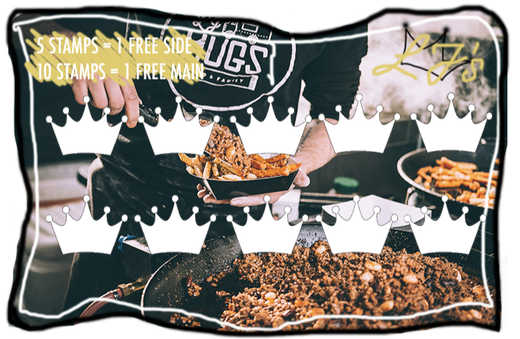
 When it came to producing some visuals for this work I decided to start with the reward card scheme, the reason for this being that when it came to producing the content for his instagram I would be able to add this into the advertising section. I wanted to create a points card / reward system for LJ because in order to interact and appeal to the younger generation in the demographic I felt there needed to be some interaction. By having a stamp card that eventually gives you a free meal, students can look forward to something and eventually will be saving themselves money, which would attract more students.

 Currently LJ has a stamp card, however this is not well advertised and is only showed in the corner of a picture when selling seasoning! I want this card to be more of a reason for the younger demographic to go, so I want to create one that is aesthetically pleasing and also does the job. I want to have 10 stamps on it, initially I was going to have it where you received your 10 stamps after buying 10 meals and the 11th meal would be free, however i did some research and looked at the loyalty cards I have and found that actually it might be more interesting and more rewarding to change it up a little bit. Below are some images of cards I have, showing how I wanted to initially have mine, and also a good alternative:


 By separating the 10 stamps and having different rewards I thought it would be more rewarding, especially to the younger generation, but also the older! This way there is something to look forward too sooner. So I started sketching some ideas out, firstly experimenting with colour and keeping it more simplistic.


 From the very beginning I wanted the 'stamp spaces' to be crowns , this way it would link in to LJ's logo and also make it look more unique as opposed the other cards which are typically square or round. In regards to colour I wanted to choose colours that were easy on the eye, but also stood out without distracting from the card. The yellow / mustard colour came from his website when you hover over the titles as they change to this colour!
LJ's
However upon studying this I found it is very boring, doesn't tell you much about the business or LJ himself and therefore wouldn't reflect him or his business very well. Next I wanted to incorporate an image from his website and also some more hand drawn things, so add the originality to it. This next card went through a lot of adjustments, trial and error and experimentation!


The front of the card would look like this, the hand writing with his logo and an image of the food! I also quite like the 'messy' looking border I put around it as this gives a visual aesthetic that is interesting and not typically rectangular and average! It may also show a children friendly vibe as it could reflect it in the way in which it had been designed.


 In regards to this design I really like the layout of it, however if I had to change it and perfect it I would want the text to stand out more as it currently looks very busy and more hard on the eye than easy! Overall I really like the crown idea for the stamps as well as including the image from his site. I think in terms of practicality and use, the idea of having 5 stamps and being rewarded a free side, then 10 stamps rewarding you with a free meal would be really effective and good, for both LJ and his customers. I have also printed out and put together some mock versions of these that are located in my sketch book. 

Monday, 4 December 2017

LJ Hugs - Moodboard.

Instagram Ideas
 When creating this mood board I wanted to look at existing food accounts on instagram to see their layout, colour schemes and overall aesthetic. I decided to add a range of places into this board, for example Gourmet Burger Kitchen, along with Jamie Oliver and also some independant cooks as I wanted to include a larger variety.


 From producing this I was able to see that a lot of businesses in the food industry tend to use a set colour theme and largely rely on high quality images of their food, as opposed to advertising menus, prices, offers etc. This is interesting research as it inspires me in regards to layout as colours. In regards to the content it seems to me that accounts either heavily rely on videos to get across their food, or heavily rely on images. I only came across a couple of accounts where they mixed the two, so when it comes to me creating and re vamping LJ's instagram I want to have a mixture. On the other hand I want to mainly rely on photographs and edited pieces regarding his food, perhaps having one video a week, or fortnight.

FMP Showcase.

To complete this year (and the previous year) off we held a showcase in the Apex Hotel in Bath. This finished off the final part of my FMP a...