Thursday, 5 April 2018

Online Advertising.

Digital Marketing
 Another large part of my FMP for me is creating some form of online advertisement in which is relevant to the product, and the demographic. When thinking of ways to do this I immediately gravitated towards adverts on YouTube (whether that be sponsored videos, banners running along side, or advertisements before and throughout) along with website advertisements ( for example through Facebook, Instagram etc).

YouTube Adverts
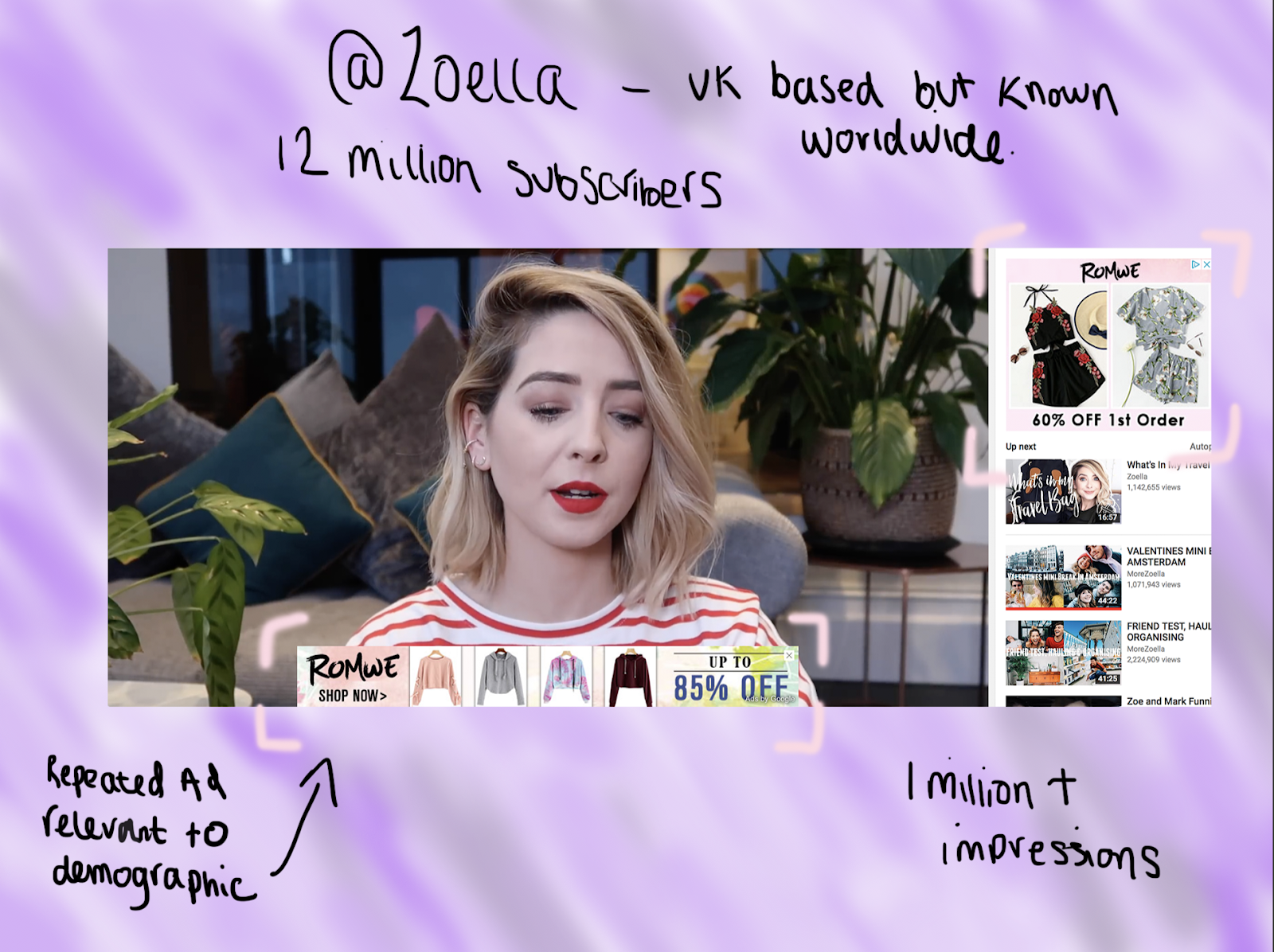
 So to begin this portion of research I went to youtube to find the three example above, one of each so that i have a variety and can look at their effectiveness, I imported the screenshots into photoshop and decided to annotate around them (easier said than done!)

1


2


3


4

 After I had analysed these 4 individual different ways of advertising on the platform YouTube I can see how brands heavily rely on these influencers to sell their products, whether that be directly in a video, or subtle hits and adverts along side. For me personally I prefer the more subtle hints, just because I like someone as an 'influencer' and they get paid to sell a product to me slightly puts me off! Sometimes when I see the banners for example on Zoella's video as shown above, I am more inclined to look at the product, because I can exit the ad at any moment, rather than the whole video being based on something, or video adverts before be able to view the video!
 Something I have only seen recently is the most subtle way of advertising, this was in the description box of another Zoella video as seen below:

 As you can see it clearly states "any links below with a '*' are affiliate links" meaning that she receives a percentage of the revenue that is made from her audience purchasing those particular items through her links. Something to put into perspective from this is that she is clearly a high respected 'influencer' and the more brands can use her and her platform, the more products people will buy.

Claris Clean Ad
 5The next thing I decided to do was research and discuss a very interesting internet article to me. This article was called "Clarins Cleans Up Ad Game" it discusses how the beauty and skincare brand Clarins managed to re evaluate their advertising techniques and clean them up all in one year. Initially Clarins adverts would pop up on art websites, irrelevant to those visiting the website as they had no interest in beauty. The reason their adverts ended up on these sites were "as a result of it's investments in programmatic advertising, which doesn't allow advertisers to control where their content appears"
  then in 2017 the brands "served 30% more impressions through direct channels than the average company" this indicated that the change in strategy had reversed. As the brand switched to direct advertising in 2017, YouTube became its top publishing site for video ads. To me this is a really important bit of information as it tells me that if I were to create a digital marketing advertisement for my products, YouTube would infact be the most effective space for it, especially given that it is beauty.


Instagram Posts
 The next social media site and outlet I investigated was Instagram, the reason for this being that it is one of the most popular social media sites worldwide, and the fact that it is a visual site, this is important for me regarding what I am advertising as it would be perfect for this site, as opposed to twitter.


When scrolling on my Instagram I constantly come across either sponsored posts (people / companies I don't follow) or #Ad / #Sponsored posts by individuals - as well as brands- I do follow. By having the hashtag AD, it lets viewers know that that particular post is sponsored by the brand and they are getting paid to say / review the product (the exact same as YouTube). The first one I found that was relevant was by the makeup company Sephora, they did a '#Regram' of a post done by a makeup enthusiast.

  When it comes to my project personally, I feel like creating an ad like this, where it includes a video, wouldn't be something I would want to create, a lot of the adverts I see on Instagram are tutorials or shot videos showing off certain products. On the other hand I have also seen images that are adverts too, however I feel as though using video is more appealing and grabs the audience, enticing them into the product. This being that through a video you can watch someone use the product, you can see their personality, the techniques they use and more, almost showing you that it isn't just for professionals.


Next I came across a sponsored ad on my timeline, by a brand I do not follow. This again was a stop motion video advertising the product to me. This is much like the above video however the brand are trying to reach new customers, the one above already had my attention are I follow similar brands afflicted with Sephora, along with certain influencers. Then this brand 'Alpo' wouldn't be attached to me or my profile in any way shape of form, so they are most likely expanding their demographic and aiming that particular add to me and those in my category.


Conclusion 
 To conclude, my findings here have been successful and very eye opening to the world of digital marketing using YouTube, Google claims "YouTube ads are more effective than TV"6  which isn't surprising to me. I feel as though the use of TV and advertisements on TV are becoming less effective for the new generations, I don't remember the last conversation I had with peers about what was on the television, it is all about YouTube and Netflix now.

Things I will apply from this to my final product...
  • From these findings I now know the type of banner and advert I want to create for YouTube, meaning that I can now look into appropriate dimensions in order to create my mock up, along with who I will place my 'ads' with, taking into consideration what the youtube video is about, and what the demographic is ( Uk based as opposed to international for me)


1:https://www.youtube.com/watch?v=wRNYoWFjmEc&t=185s
2:https://www.youtube.com/watch?v=gL9zZaBw2pU
3:https://www.youtube.com/watch?v=eljAjPH6zQI
4:https://www.youtube.com/watch?v=fAZjCdenE8s
5: https://www.l2inc.com/daily-insights/clarins-cleans-up-ad-game
6:https://www.theguardian.com/media/2016/apr/20/google-youtube-ads-tv

Tuesday, 3 April 2018

Build A Digital Marketing Plan - Google Presentation.

Primary Research
 Conveniently this presentation that was hosted by Google in college conjoins with my project and the way in which I want to market my products. I decided to take some notes as this will be useful for me, not just for my FMP but also when I leave college and my future with digital publishing/ digital marketing.
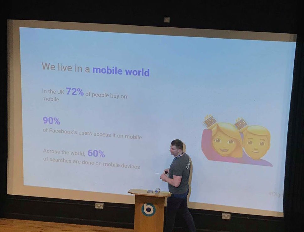
 The whole presentation was based on building a digital marketing plan, shooting facts and statistics I had never even explored or researched before! First of all I learned that 72% of people in the U.K buy products on their mobiles, and that across the world  60% of searches are done via mobile. In relation to my fro this is interesting because I want to advertise and market my makeup collection digitally, however I also want to produce one poster (physically printed), these statistics however back up my idea that  I want to primarily produce my makeup collection and the advertising for these products online, after all that's where everyone is looking!
 I had taken some pictures of the slides in which I thought were vital and intrigued me so that I could further research into those specific places, below you can see a handful of them:


 At the end of the presentation there was also an opportunity to go online to google and learn from them, doing short courses (15 minute courses for example). I thought this was really interesting, even just to expand my knowledge and learn something new, so I went to the website and set up my first course, this being the introduction as seen below:


 This will help me with my FMP as it will extend my knowledge on the world of marketing products online and the importance of using certain sites and techniques to do it successfully. I will Complete these lessons and if I enjoy it I will continue with them in my spare time, and look forward to learning more about building a digital marketing plan!

Mood Boards - Existing Products & Packaging.

Product Packaging
 This next mood board I produced consisted of the makeup products I own and have kept the packaging for. I decided that when it came to this section of my research I wanted to create a collage based on the products I had bought and can physically see and feel the packaging for, making it clearer in my sketchbook for texture purposes. I looked at a variety of products, ranging from primarily eye shadow palettes, to lipstick and power packaging. The reason I specifically chose the items below was for the variety in texture and colour they have on their packaging. I can see gold foils, chrome finishes and 3D printed letters, then a more simple design for the NARS foundation with a matte box and white plain writing, keeping it very simplistic which was good to keep into consideration as simplicity and colour palette were the top two most important features according to my demographic. The first collage was to be kept as simple as I could keep it, as a more textured and 3D version is available in my sketchbook. Something I found really interesting was of course that the outer packaging to all the products I own, match the packaging of the physical product inside, however varying materials as you will be able to see in my second college. For example the Modern Renaissance eye shadow palette gives a cardboard exterior, then the actual palette itself comes in a velvet dusty pink box, then within that you have the eyeshadows, all of which relate to the chosen colour palette of 'neutral and berry tones'. for me when it comes to physical inspiration for colour palettes and brands I think Anastasia Beverly Hills is one of my main creative inspirations, I like the materials they use and also the colour tones of each individual product, the quality feels amazing and the outside packaging and advertising really does reflect and match the product inside.

As you can see all of the products packaging include some sort of embellishment of ink, and also involve a lot of rose gold/ gold somewhere on the packaging. I personally hadn't noticed this about all of my products but after this exercise I decided to look into the reasoning for this and came across this interesting internet article that explains the latest trend and the reason behind it. The title of the article is 'Metals and Metallics Are Trending'1 and Mike Warford (director of sales at ABA Packaging cooperation) says that "Metal and metal effects for primary packaging give the perception of high value and luxury product" However it is not just used for makeup, but skincare and fragrance too, sporting a metal cap and clear glass bottle. David Greco who is the vice president of sales added that "we have been getting many requests for metal, especially for lipstick cases and compacts"
 This is really useful information for me as I did already know I wanted to add one foiling and rose gold onto my packaging, however knowing the theoretical reason behind this being a popular print it now encourages me to continue with my idea, as it backs up my thinking for products that include this in their packaging tend to be more popular and aesthetically pleasing!

 Now below I constructed one more college using photoshop to briefly show what the products themselves look look once taken out of the packaging as seen above! This was something I wanted to do so that I can show the ouster packing reflects the product inside and why it is so important to keep designs consistent, through adverts, to the packaging, to the product!


Something that was very clear for me was that the packing did intact reflect ht product inside, however not all the time. For example the Kat Von D eye shadow palette had a very dull outer packaging and very dark muted colours within, however there was also an orange and red shade that one would hot necessarily expect if you didn't know what was inside! Then on the other hand you have the ABH Glow Kit, with a body of chrome packaging that shines and changes colour depending on the light, the product inside reflects this completely, coming with all shades of glitter and holographic like highlight shades within, something you would expect from the packaging! Saying this however it isn't necessarily expected of the brand to have the packaging match exactly what is inside, maybe it gives it all away, or sometimes the packaging can override the product inside, leaving you with disappointment, as you expect so much of it inside and it lets you down.

 After producing these sets of collages using my own products and the materials and colour palettes they use, along with comparing them I have been able to see what appeals to me and also what my audience mean when they say they think colour palette and minimalism is priority for packaging. However I do think these two are almost opposites, how does one use vibrant and aesthetically pleasing colours to attract customers and reflect the product within, whilst still ensuring it is minimalistic and doesn't give too much away or distract you from the product inside.

Things I will apply from this to my final product...
  • The use of metallic/holographic is definitely something I will incorporate into my designs, I think the way they look and feel gives off such a nice vibe and sets your expectations for the quality product inside, something I wish to aim and strive towards.


1: https://www.beautypackaging.com/issues/2015-04-01/view_features/metals-and-metallics-are-trending/42055

Weekly Reflection.

Secondary Research and lacking motivation...
 As it stands the deadline is looming for this project, and as I have mentioned before I feel as though I may have over estimated the amount of work I can compete to the standard I am happy with. Looking at the master brief, along with my own detailed lists as long as my arms, I see myself drowning in work meaning that I had lost momentum and motivation for a period of time. Battling through this and working on my secondary research I produced a case study based on an internet article this was my blog post titled 'KIKO's Success' (here). When looking into makeup brands and the current competitors I found as though theres so many to look at and so much information to absorb, meaning I needed to narrow my searches down slightly. So I started this by exclusively looking into national brands, and those of which came up in the Top 10 Brands in the U.K. Why I chose the brand KIKO was because when I was researching into brands and pricing, KIKO sat in-between what we would class as 'Hight Street of High End' products. I wanted to investigate what puts them above others and is this having an influence/ knock on effect to other well known brands? if so why and how.
The thing that I was most intrigued about this case study I produced was that it is inspiring the other brands in the top 10 to change their ways, it also allowed me to investigate into why perhaps their products can range form cheaper to more expensive, and does their packaging (more bland, dark colours) come into the price?

 After I had produced this case study it opened up a whole new can of worms that I needed to research for this project, why their prices range so much? does the packaging effect the prices? Is it the same for some of the higher end brands? so on and so forth. Despite this I decided I needed to focus now on the physical project and the practicality of getting my packaging professionally printed and made, as this would look better than if I were to do this myself. I made a blog post names 'Cosmetic Packaging To Order'. This was one of the research articles that took a lot more time than I had anticipated. When it came to my FMP last year, I found printing a magazine was very easy, whether it be online or in a physical shop, the prices were good as was the service. However because of what I want to create this year it was a little bit more difficult to find UK based brands that were cheap, and also allowed you to order some packaging under the quantity of 200!
 As I briefly mentioned in that blog post I think as long as I have all of my digital visuals and everything produced I will be happy, I think that the marking board and tutors will be able to see why I might not be able to have them physically printed to a high standard as it is just something that is really difficult to have made, so I will try not to focus and worry on that too much.


Soon after completing this crucial research I was able to look back on the questionnaire I had produced, to find I had 31 responses which was a number I was happy to work with, especially when it came to looking at the submitted responses and the variety of answers I had! I decided to produce an infographic in order to show my results in a more visual way especially as my whole project is based on visuals and creativity! I also put all of the answers into a spreadsheet too, as this way it was easy to look at ALL of the responses to compare and contrast them. 

Lastly what I want to discuss in this post is the moodboard for the colour palette I created. This can all be read into great depth over in that particular post here but as is stands I need to get a wriggle on for my mood boards. As of right now I want to still look into potential box / packaging, that will be done through existing products and looking at the wire variety or the different brands, along with brief research into brand prices for the same products and what the difference is between them (i.e more extravagant packaging = more expensive? or are people paying for the brand name due to those linked and associated with the brand). In addition to this I also want to look into websites that sell branded products (asos?) along with YouTube and the way in which advertising is done through that particle platform. Once I have looked at all of these I will then be happy to move on to looking at advertisement posters and banners to get inspiration for my own work, then allowing me to move off from the research side of the project and begin my visuals and creating!

Monday, 2 April 2018

Mood boards - Colour Palette.

Colour Palette
 When creating some mood boards I knew I wanted to produce one based off of existing products, one colour palette and at least one of different styles of packaging. Firstly I decided to go onto Pinterest and look up colour palettes and inspirations for my FMP. I compiled a variety of different images, all inspired by the theme and direction in which I want to take my FMP. I put all of these images together in photoshop and produced the screenshot below: 


 As you can see there is a large variety of images in the collage, the reason for this being that when creating my colour palette I didn't just want a colour wheel of different blocks of colour, I wanted to show why I am inspired to use this colour, how it can look when effectively done and also these images above can be inspired when I produce my digital advertisement poster. For my poster I want to make a mock-up photoshoot (if able to have products professionally printed) or do it all digitally using my own images and sketches. I want to make it look like a mini campaign for my three products, using plants, chrome, dusty pink and hints of blue and rose gold throughout.

 Once I had produced this online I decided to print i out along with a couple of other images and make a visual collage in my sketchbook, using some gold ink and blue watercolour as my background as seen below:


  Producing this in my sketchbook was good because it allows me to experiment with placement of images and colouring. It visually shows the direction I want my FMP to go in, so that when I later produce sketches and other things you can look back to that page and see the inspirations behind my work. Colour palettes are really important in a project, specifically for me producing a makeup collection and packaging advertisements. From my questionnaire results (here), 11 out of 30 people said the colour palette of makeup packaging was the most important, along with minimalistic designs. After producing this secondary research on the type of aesthetic I aim to achieve it has inspired my designs for my makeup products and it's packaging. To reflect on this work I think this was crucial to complete because it shows the foundation in regards to designing and where I am creatively coming from. I think to build on this work and improve myself I can show my findings in sketches and show more of my progress creatively in my sketchbook.

Things I will apply from this to my final product...
  • The colour palette I chose will reflect the collage above, I am certain now the theme and overall aesthetic that should be reflected in my final products and marketing advertisements.

Monday, 19 March 2018

Questionnaire Results.

Makeup Collection
As briefly discussed in my weekly reflective blog post (here) I had produced a questionnaire to aim at females ages 18-25 regarding their personal use of makeup and opinions on makeup. The reason for this being that I was able to gather some initial feedback and answers from those in my demographic, and it also meant that before I started sketching potential ideas for products, I would look at the brands and packaging they prefer, along with the most popular products and price rangers, as all of this will influence my packaging! Below I constructed an infographic displaying my results (higher quality here)


Once I had produced my questionnaire I sent it off on my snapchat story along with a post on Facebook that got starred by a blogger, giving me even more responses. I gathered a total of 30 responses before creating my infographic as I wanted a large variety of responses and thought that is a solid number to begin with. I received 42 views on snapchat over a 24 hour period, this is something I haven't done before as the last FMP I did I kept it on FaceBook and didn't experiment with social media outlets and using them to my advantage! 


 The type of questions I asked on my survey were those to gather information that would later help my development of the project. For example I needed to know the brands people like, so that I can specifically look into their packaging and advertisement techniques. In addition to this I looked into price ranges, again this will help me when it comes to packaging, for example those wanting to spend little will need more minimalistic packaging in order to keep costs down, but those willing to spend slightly more means I can add more colours, effects and really make the packaging pop. This initial survey was really useful for me, I can now produce collages in photoshop and in my sketchbook of existing packaging, along with beginning my sketches and advertisement techniques. Before I start my designs however, I will research into advertising techniques online and printed, this will help me as I can look at existing YouTube banners for example, and see what makes them effective!

 With my infographic displaying my results in a more visual fashion, I also made a spreadsheet that gave my questionnaire results in a more uniformed fashion as seen below of here for higher quality:


Something I couldn't go into much detail on in my infographic due to space was the brands people selected as their favourites. Much to my surprise people submitted a lot of 'other' options ranging from NYX, KIKO, ELF, Avon to Estee Lauder & Makeup Revolution. The most popular brand was MAC, the least popular being NARS, this will all inspire my work. 

Things I will apply from this to my final product...
  • I need to keep my packaging minimalistic, and also need to really take into consideration the colour palette I chose to go with as these were the two most popular results.
  • Prices should differ between cheap - mid end, I need to find a place in the middle for when I finally advertise my final products on my website.

Cosmetic Packaging To Order.

Ordering Cosmetic Packaging
 When it comes to the production of my packaging I wanted to explore the different options, which are...

  • Making box net on Illustrate then import into InDesign 
  • Print and stick to cardboard 
  • Print on laser cutter 
  • Produce visuals online & send off to professionally print
  • Order plain boxes online, print and stick
The issues I have when it comes to printing at home or at college is that I won't be able to achieve the foils and inks that I wanted to print and having the more 3d effect when printed. I decided to research companies that produce custom made boxes, much like my last FMP researching places to get my magazine printed as I wanted a more professional look to it.
 So I googled UK online companies that sell and manufacture custom made boxes, however a hurdle I came across quite early on is that a lot of companies require high quantities to order, something I don't have the money or need for as it is just the packaging I need to have a final product. I came across three sites initially and got some quotations, one more specific and included pricing whilst the other two needed images and a lot more information that I don't yet have.
 Firstly I found 'Custom Boxes Co' (here), this website was full of a lot of information and things I need to consider, but hadn't really come across yet as the physical side to production hasn't come into place yet. The first thing I saw when I clicked on 'Lip Stick / Gloss Packaging' was this image that displayed the paper type, printing specifications, special effects and more:


 The next thing on their site was the shapes of boxes, which is of course something I had thought about, however not into such detail. Below is a small screenshot of the available box types, this is something that when it comes to sketching and illustrating I will look into deeply, however as it currently stands I don't want a window in my box!
 So what I decided to do was get a quotation, just to see a rough price guide line and below is the response I received.


When I have more specific dimensions and designs I will put in another quotation with the information that is more precise, however the screenshots below show me some of the printing options below which is what I want to experiment with!


 Next I looked into 'Go Custom Boxes' (here) that had a similar website to the first one, needing measurements and examples of printing.
The quotation I received for this company included exactly what I needed, prices. As seen in the screenshot below the quantities are too high and so are the prices, which is why I now need to re think my printing idea, or just keep searching online and perhaps locally in Southgate for potential options for printing. 

  Thirdly I found the site 'ABC Packaging' (here), they did similar packaging to the other two sites, however didn't specify in cosmetic boxing in the depth I would be looking for. However despite the lack of images and information I decided to still get a quotation to see what they had to offer, as the other two sites there was no mention of pricing what so ever. 
 This email alone shows me that I will not be pursing or continuing ahead with these websites, I don't need anywhere near 1000 units, nor can afford to fund them! When it comes to my final major project I really want to produce a physical product to show, however the whole idea is digitally advertising my brand and it's packaging so if I can't execute the physical packaging to the quality I aspire I don't want to be too disappointed. If I have prototypes, models, digital versions from all angles I think that would be more than enough. Saying this I will continue to search for website and potential places where I could print perhaps 10 units in total so I have a couple of each product to display.

Things I will apply from this to my final product...

  • Professionally printing my cosmetic packaging may not be the easiest, best use of time and money, I will focus more so on the digital side of the project after receiving these quotes.
  • I will consider the type of box itself, I now know that I do not want any type of 'window' in my box for example, I want to keep it simple and plain so that the key element is the design of the packaging and the way it is sold.

FMP Showcase.

To complete this year (and the previous year) off we held a showcase in the Apex Hotel in Bath. This finished off the final part of my FMP a...