Tuesday, 1 May 2018

Final Designs & Final Experimentations.

Designs
 After producing multiple digital mock ups ad a physical mock up of my product, it was time to finally produce the final versions of each product. To do this I decided to make each individual item (on Photoshop) and then make a net design of each item and what it would look like. Before I began the final products I had some font to add to my products of course which was something that needed some trial and error. I wanted to make my logo and overall design link up to the rest of the writing on my products, however I didn't want it to blend in and all become one.
 Below you can see some screen shots of my eye shadow palette and the change in colour and background of the name. Again like my logo I wanted to incorporate texture into my name so I creating clipping masks of some images, one of which included the smoke from the photoshoot.


Pink smoke used as clipping mask


Same image as logo and leaves 


Image used for background of website used for name of palette

My favourite one would be the last because of the way I incorporated the image that links to the website and it also incorporates holographic theme, keeping it all linked together to have consistency throughout. I have inserted below some screenshots of my netting in progress, using specific measurements in order to print them out and make physical mock-ups. 


I decided for the 'flaps' of my products packaging, rather than having them plain black I would put the holographic photo that I used as a clipping mask for my logo, again to give the product some consistency as well as some more colour and interest to the packaging.
 

Final Designs
 Once I had done some final tweaks to my packaging I was able to fully complete al three products (Lipstick, Eye shadow & foundation). This happened later than anticipated when looking back on my time scale, however moving positively forward it now means I can produce my mock up photos for my website, poster and YouTube Ad. I think when it comes to the YouTube Ad I will use photoshop, but to present my work I want to perhaps try and incorporate it into my website as an image that is mocked up to be an advert. The issue with my proposed YouTube advert idea is of course I cannot pay and make an advert for a brand that doesn't really exist. 


PhotoShoot Final Images
 As briefly shown in my BTS photoshoot I briefly played around with the images I had taken, trying to incorporate some holo into the images in a doodle way! This for me was unsuccessful as it didn't give me the overall aesthetic I wanted to achieve so I therefore did some more experimentation as seen in some screen shots below:


These images were really fun to experiment with using a variety of images curtesy of Google, to give some texture to a photo and some more depth. These are the types of images I want to have dotted around my site as the colour of the smoke in the foreground along with the tress in the background relate to both the colour of my products themselves as well as the packaging. For some it may be easy to perhaps see no obvious link or correlation to my products however when I was researching existing beauty websites 8 out of the 10 sites I explored featured photos of models in perhaps an 'unrelated scene' BUT they showed the type of person to perhaps use their products, the setting often reflected the product of the brands ideas and inspiration etc. The direction this has taken me has allowed me to add some real photographs into my website and production process as I have now created my digital versions of my products!

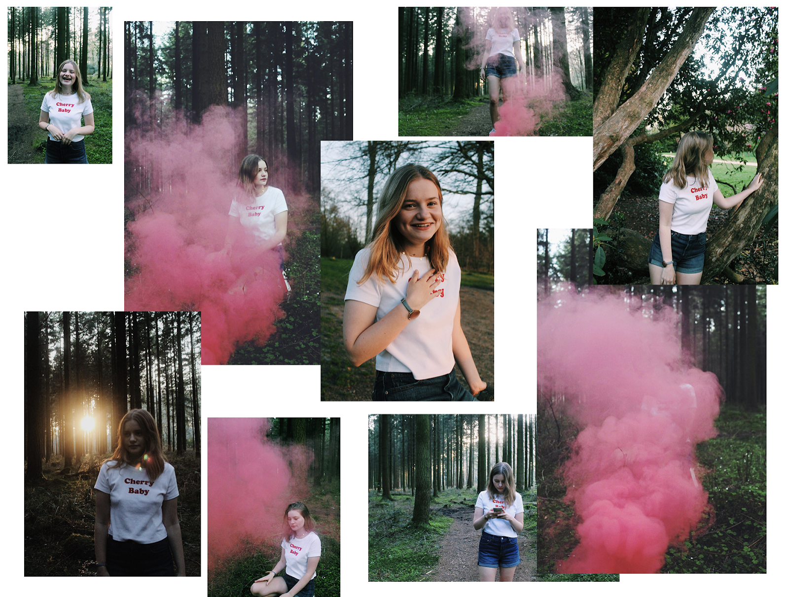
 I also decided to quickly produce a little collage consisting of some of the images I will be using, and ones that I couldn't fit in to my brand and direction specifically but I thought it would be worth adding into this post to show my experience and direction my final project has moved to. I knew the time and aesthetic I wanted to achieve with this photoshoot, however with things like this it's also orate trying some shots even that aren't planned just incase they can be relevant, or even if they're just to experiment with!

Conclusion
 As my production has come to a conclusion I can now move forward to creating a blog post showing my website and then also begin to look for way to improve my work. I have in fact done a focus group with peers that are in my demographic discussing my products and website and any possible improvements which will be discussed briefly in a blog post to come! As of right now I need to go back on my timesheet and update everything adding links to my own spreadsheets to get everything organised and easier for the markers to view my work!

Weekly Reflection.

Production
 Upon reflecting from my last reflection blog I have made a lot of progress in regards to moving forward with my project and 'get the ball rolling'. Once I had received my questionnaire results about my designs I was able to kick start the production of my final designs which then allowed me to see the overall aesthetic and 'vibe', consequently allowing me to begin the production of my website and more.


 The website creation part was by far the most interesting for me. At this time I hadn't had my final results and created any mock ups that look like how the real product would so I was just at the point of choosing templates and adjusting the pages and layout. I went through two templates and styles before I ended up with the one I have now, and I also needed to adjust the individual pages, including sizing, tabs, buttons and more. At this current moment I have produced my final designs which can be seen (here) meaning I can now insert them to the website. Once thing I really want to do in addition to this is when it comes to adding photographs of the products online I want to try and include some swatches or something extra rather than one image. I am also going to have a look about creating a 3D image to put on the website in the 'Shop' menu as this would make it more realistic looking. 


 As I have discussed in a blog post, when looking at my template on WIX I wanted to include some of my own images. This meant undertaking a photoshoot, I had the place time and date planned, along with a model and some 'smoke bomb' props. I wanted the images to be free flowing, I wanted them to express happiness and confidence without having a typical 'head shot' of a model with some eye shadow and lipstick on! By having mine in the woods around sunset time on a warm evening you can really tell the overall vibe through the pictures. I also contemplated bringing some material with holographic- like features to put in front of the lens to give a 'flare' like effect, however I couldn't find any with the qualities I wanted, therefore I will experiment with this on photoshop! 


Reflection
 When looking at time scale and what I have left to do, I think it will be a push however it will be done. Realistically I need to...
  • Edit some photos with some form of holo merged into them some how
  • Create a photoshop document that lays my products out in a way that makes it look like a photoshoot had happened
  • Upload images to website and write description
  • Produce YouTube advert banner
  • Produce 'bus shelter' poster
These are all tasks in which will be time consuming however once I begin the edit I will be able to go through my tasks fairly quickly I think!


Thursday, 26 April 2018

Photoshoot BTS & Experimentation.

Images
 This blog post will be showing the process of my photoshoot which I decided to do and add to my list of things to complete. I initially wanted to do a shoot before I realised that purchasing and printing my products would cost too much, so I then began to complete the rest of my work, however when putting together my website I realised I wanted to photographs. I have briefly discussed why I chose to do this shoot in particular in a previous blog post. So I ordered the smoke bomb and headed out to the Longleat area to do my shoot. My model wore a white t-shirt with some red simple writing on it, this went really well with the colour of the smoke and also keeps it nice and simple for the images for my website promoting the makeup and over all vibe of my brand. I have inserted two inspirational pictures for my shoot curtesy of Pinterest and some example images I took before the editing process.
Pinterest

Pinterest


For me this photoshoot was really fun and also was a way to aesthetically represent the fun, free and confident side to my brand. I had taken inspiration of many photographers and read a lot of blog posts discussing the ways in which this is done successfully (i.e not set fire to a forest!). I messed around with the ISO on my camera as I aimed to get to the forest around sunset (7:30-8pm) because I wanted that kind of lighting as you can see in the last photo I inserted. These will look really effective when edited and added to my website, because this way I will have a mixture of my digital products and actual images I had taken, both of which represent the brand and products I aim to sell. 
 When editing these images I will use Lightroom and Photoshop. Some of the images I will keep as they are after minor tweaking, however I want to experiment with layering like my last year's FMP so that I can try and incorporate some holographic effects.  
 Initially I opened up Lightroom and began tweaking, however I wasn't getting the full effect I was after, what I decided to do was open up VSCO the editing app and use this for my photos. This is also what happened for a lot of my photography last year, I ended up resorting to this app because it gave me exactly the effect and overall vibe I was aiming for! As you can see below I chose one image and effects that completely change the photo:
 Things such as exposure, contrast, highlights and more are also adjustable so t's just an easier lightroom! I decided to edit all my photos I had chosen (17), this way I have a large variety to chose from when it comes to the website as I will only need a few!


 As you can see in the images above I experimented with layers and clipping masks yet again in order to try and incorporate some doodles/ holo into my photographs. In my opinion they aren't bad, my preference is the dotty look, however it didn't give me the overall aesthetic I wanted to achieve so will continue to look for inspiration and continue with experimentation in another blog to follow...

Monday, 23 April 2018

Website Creation.

Visuals
 When coming up with ideas for my FMP I knew I wanted to have it more digitally based in comparison to last year where my final product was a printed magazine. One of the things I was certain I wanted to create was a website. I envisioned producing a website that offered lots of visual elements and also worked like any online store, this would tie in my advertising on YouTube and also nicely link with a key element of my research where I looked into website that stock certain brands. I think it would be really interesting to produce my own website using the colour palette and same visuals, adding consistency and comprehensive understanding of the digital program and the brand I am creating.
 So to do this I decided that I would use WIX, the main reason for this being that I really like their templates and how simple it is to make a website look so professional. I have previously used this site however that was just a small part of a previous brief, so this time round I am looking forward to finding out more about the site and how it works. Here is a link to my first website I created on WIX, this is my online portfolio that I should ideally update as currently it isn't up to date with my work, however it shows the style of website I was aiming for and also visually shows that I want! I have provided some screenshots of my website below:


From looking at my own previous work I intend to better myself and my skill set considerably for this website. I have compiled a list of things I want to include on the website and also have produced a rough sketch on what I would ideally want the site to look like and include, as seen below:


 As my brand name is 'McQuaid' and I am branding my logo slightly differently to the one I currently use, I need to ensure that I slightly alter it to the one you can see on my mock ups as I want it to stand out slightly more. I want to incorporate parts of my current logo that you can see above as I think it would blend nicely together however this isn't a priority for me! I think the above plan can be produced with the use of WIX, I have started browsing their templates and have come across a section of 'beauty and wellbeing' and selected a template that I think would work really nicely with my aesthetic. 

Of course as mentioned before, all of my project par a couple of things are all digital, for my website however I do want to have some of my own photographs, incorporating smoke and plants/ some organic images. I am going to do this shoot on Thursday 19th (given good weather conditions). I have already done a recce on the place in which I want to do this, I also have my 'smoke pellets' that I ordered form amazon ready. There will be a separate blog post regarding that and it's success.

 So in regards to the creation process of the website I have tried a few different templates and layouts, trying to find a website that will reflect my brand and my products was difficult as of course I am only bringing out three products and I haven't physically made a lipstick, it will be difficult to get some images, however I plan on getting some appropriate swatches and images of them to reflect the products, I think this will help give a visual idea.
 
  When faced with the first template I felt as though it didn't give me the over all aesthetic I wanted to achieve. Even though it was lovely I feel as though it wasn't appropriate for my brand at this current moment. So I opened another template and set the background to a holographic sheet, along with editing some minor parts here and there whilst I wait to create my products. I altered the bar and also the sizing of a lot of things.

  Next I got onto the products page and began editing the products that were on the website. I created three and began to write their description and pricing in preparation to launch. I will add my own images shortly once I have produced the final ones in Photoshop as I was waiting for my questionnaire results which have now been analysed (here)


Friday, 20 April 2018

Questionnaire Results.

Packaging
As discussed in my previous blog post here I have constructed a questionnaire to give to my demographic regarding the packaging design mock ups I made. I decided to send this out on my social media's as previously discussed in order to get the attention of females aged 18-25 in the best way possible. These included Snapchat and Facebook as reflecting on my previous questionnaire, using Instagram didn't get me any additional responses because the 'swipe up' feature is for verified accounts only now, meaning you would have to post a story requesting followers to follow the link in your bio, and by this point no one had bothered.
 I currently have 15 responses, I really was aiming to gather at least double that and if I allowed more time I would received that may, however as the deadline is looming and I got back some really detailed responses I decided to cut it short here. This time round I also decided that I wouldn't present my findings in an infographic, the reason for that being the specific questions I asked would be more appropriately put together in a spreadsheet form, as the answers are long.

 Question 1 was asking the audience which design out of the 7 mock ups I had made was their favourite, there was a mixed response however the top three were 7, 3 and 5 as seen below.

- This was the most popular design by 33.3%, it features the leaves in their natural form, along with some shapes and marble dark background.

Number 1


-This was the second most popular design, it also features a dark background, however it features the leaves with a holographic effect that matches the logo along with shapes.

Number 2


-Lastly and surprisingly this design was the third most popular, it is the complete opposite in comparison to the other two designs as it has a light pink smokey effect.
Number 3


 This question was one of the most important questions out of the whole survey as it allowed my demographic to chose the things they would specifically gravitate towards and would prefer. For me I now know that they like the dark backgrounds, and I would also add to this conclusion to this question that they prefer the leaves natural rather than with the holographic clipping mask, however in another question I asked "Do you think the packaging looks better with the holographic leaves?" and 73% said YES.

 The least favourite designs were the two below, which was something I could have guessed. The reason for this is that when creating my questionnaire I realised that all my designs either had black or pink backgrounds, so in order to mix it up and give them a more colourful option I decided to make their backgrounds colourful. Below you can see the bottom two.


 'Why did your favourite design stand out to you and what makes it better than others?'
This question was also a rather important along with the question that followed. Gathering feedback straight from the consumers mouth and allowing them to say exactly what they think about a product makes my production a lot easier as I can tailor my products specifically to what they say and the overall opinion. I gathered a large array of detailed results for his question, all of which went into either great detail, or gave very short but useful feedback. 


A lot of the audience liked the contrast of colours along with the variation and vibe. This is perfect as that is exactly what I was aiming to achieve, I wanted my audience to like the overall look and vibe, the colours I wanted to stand out but not be too in your face. 
 
'If you could make any improvements what would they be?'
 This next question was just as important as the previous one because this is where the audience have the power to alter my designs and see what they would change if they could. I have inserted another screen shot for you to analyse showcasing a few of the results:

The overall opinion was to remove the shapes and make it more simple. I feel as though by removing the shapes and having the background as a subtle marble black background this would be achieved. In addition to this it seems as though the over all opinion was also to use the holographic more. This came as a surprise to me because I didn't want to go 'over the top' with the holographic so much that it becomes over used and tacky rather than a feature.

Conclusion
 From analysing these results that were completed by my audience I am able to alter and adapt my finial designs based around their opinions and preferences. It was important for me to produce this questionnaire before continuing with my final designs and adding them to my poster and website because I now have some relevant opinions on the packaging meaning that I have thought about my audience and they have been my priority. 

 Things I will apply from this to my final product...
  • I will make my final design after gathering these responses, I am going to change it to being a back marble (subtly done) background with holographic leaves and logo along with any additional features on the back (such as slogan, ingredients etc).
  • My audience is my priority and their overall opinions are the most important thing for me to move forward in this project. 

Monday, 16 April 2018

Weekly Reflection.

Visuals
 As I head into one of the most crucial stages of FMP I am now beginning to start up photoshop to put together some visuals, where that be secondary research or my own designs! Since the last blog I have undertaken a large number of projects and tasks to finish of the research segment of the brief so that I can begin my creating!
 When it came to these blogs I found myself becoming more motivated that I previously was, although the thought of the project coming to an end in just over three weeks most definitely worries you a bit! In a discussion today I was asked whether I'm on track, how I'm feeling, and all the typical questions when a deadline is looming. Although I think i'm slightly overwhelmed by the amount of work I set myself out for I am looking forward to it in a strange way. I'd say at this current point my only real concerns are when producing my digital versions of the products they may look poorly done, perhaps when being assessed they may not take into account the actuality of professional printing cosmetic packaging etc. My thoughts for this (as I've said before) were to still produce some high quality mock-ups of my designs, and to do so I initially requested some samples from two separate businesses quoting to "be more than happy to" wishing 3-5 working days. As I imagined these haven't yet turned up, even though ordered 2 weeks back, so at this point my mock ups may not be my ideal way of presenting my work, but I hope that they take everything into consideration and that my digital versions will override (after all that is what I am aiming to do!)

 So I firstly collected some products of my own, along will going onto YouTube to look at appropriate videos and seeing the types of advertisements come up, the way they do it and for what brands! I have inserted some screenshots of the work I have done however to go into detail it is best going back a few blog posts to read them!


 Products open and products in their packaging, I wanted to investigate if all packaging really reflects the product inside, and what I should take into consideration!

 The next few steps I decided to take were vital for this project, I looked into the advertising portion of the project along with websites that sell makeup and how! This for me was one of the most interesting parts I have completed so far. I was able to physically look at how certain brands want to market themselves, and at what cost.


I wanted to annotate screenshots on YouTube videos and what perhaps effects the adverts I get, and then what the advertisers themselves want to get out of it!

 Many blog posts later, delving into the world of where to buy makeup was almost like opening a can of worms. Ironically I enjoyed this however, it opened my eyes up to all the potential paths I could next take and research into in order to get my brand going and really attract my demographic. So once I had finally wrapped up my research and reflected upon all of it and how that effects the rest of my FMP journey, it was time to produce some actual good quality visuals!
 The experimentation part of this brief is so important, like last year. I vividly remember myself when creating the magazine and producing so many different pages, altering the layout, text, image type, font and more till I found the perfect combination for me. Much like last year I did the same, but with something I little bit more fun and creative. I have inserted some screenshots of the mock ups I initially done, this will be interesting to look back and reflect on once  have finished my project!


 I feel as though this year although the marking scheme has been raised and it is harder to get a good mark, I have raised my own expectation of myself. I think I had so many ideas when it came to this project that I could just keep doing it and advertising it in so many different ways! I have given myself a lot of work in comparison to last year, and even though it's 'quality not quantity' I thought that I would push myself in all areas. I don't want to produce a million things, I wanted to try and produce different things to really show my skills and creativity, to show that I fully understand and comprehend the importance of a target audience. With a website, bus shelter poster and digital advertisement places on youtube (a mock up of course) I think it shows that I have taken into consideration a lot of things such as...

  • Website- 30% of my demographic buy all of their makeup online, it shows that I can adapt to my surroundings and try to cater for every individual in the demographic 
  • Bus Shelter Poster- The majority of my demographic attend school, college or full time work, traveling to and from their destinations. It is clear to me how many people take public transport, so by subtly placing an advertisement on a bus shelter I think it is better than if I were to just 'stick it in a window at boots/superdrug'
  • Digital Advertisement- I have used some primary research I completed last year on LJ Hugs which was all about social media *infographic below*, nearly 100% of my demographic use social media and most importantly YouTube is used and it the most important to 55%. This appropriately links my demographic this time round. They are exposed the YouTube advertisements more so than a TV advertisement, it is effective and appropriate which is why I decided to do it!


Conclusions
 As I head into assignment three further, I have been on a bit of a rollercoaster and battle with time and motivation. I can say however that as I get into the more creative and hands on side to the project my priority currently is to complete these products and get a website ands poster up and running. 

Packaging Designs Questionnaire.

Mock ups
 In the post seen previously I had created some mock up / potential design ideas for my brand. Before continuing with the production of the eye palette and foundation, I decided to create a questionnaire to send out to my demographic to get their opinions on the packaging (colours, images etc). This would allow me to one last time change my packaging so that it can be the most appealing to women ages 18-25. Below I have inserted some screenshots of the types of questions I asked, along with some more examples that I produced.


The reason I decided to produce this questionnaire as opposed to a focus group was that I would be able to gather some more opinions and reach further with a questionnaire rather than a certain group of people who may be influenced by one another. The questions I have asked are also very specific, I didn't want to be too vague with them because I am still going to produce products that look like this, give or take a couple of features. I think when you get too vague people are more inclined to answer with a vague response too, so by specifying the question I hope to get specific & useful responses back too.
 Much like my initial response I will send this off on my Snapchat, Instagram and Facebook, aiming to get around the same number of responses as the first one (32) as this will be enough to get my designs perfect, with the heavy influence of the target market. Once I have received all the responses and can present my findings clearly I can then finalise my designs. Whilst waiting for the responses I am still able to produce my other products' packaging, as it is only small things that would be changed on the product (such as the background colour and images) all things that are easily changed in a layer in photoshop. 

Reflection
 Once I have received my results and presented them, I can continue my work with the poster and website. I need to work on my advertisement section next and how I would 'sell' my product if it were a real brand. This will be done through a website and poster as mentioned, however I need to look into things such as how I will lay it out on the website, and what will be on the poster to attract customers to the products. I am of course heavily relying on visuals of the products and having them set up as if they were real. I think a slight disadvantage I didn't expect to come across with this project was the printing of the products. As I reflect on my time scale plans I have allowed time for printing, this was before getting my quotes on the cost of the whole process. I think that if I physically had the products printed with the foils and effects it would look much better and realistic as opposed to a digital image. Despite this I have had to get over that, I will now need to focus on making my digital products as realistic looking as possible in order to make my poster as effective as possible when printed.


FMP Showcase.

To complete this year (and the previous year) off we held a showcase in the Apex Hotel in Bath. This finished off the final part of my FMP a...