Wednesday 30 November 2016

Recce In The Crescent.

The Royal Crescent & Circus

Today we went to the Royal Crescent and the Circus in Bath to hunt for locations for a Period Sci-fi, taking into consideration a list of things ( as listed here ). We explored and were able to review sunlight as the main point when thinking about filming, sun rising in the East and setting in the West. These points are important because we are able to know which directions to face the camera to get the desired effect and aesthetic.


   From this point of view we are able to get a good view of the crescent as well as the surrounding grass, however in addition to this we can film from a more direct angle at although the sunlight would be very powerful, it enables us to get a silhouette of characters or the trees and surrounding area. 


For example this image shows the angle that would allow us to film good silhouettes. 


   This last example shot shows how shadows can effect the aesthetic of a shot, from this angle we also cut out the road and cars, meaning it would fit with the period time frame and therefore could be suitable.


Talking about what is suitable for a specific time frame is very important, we discovered many issues along the way such as graffiti, cars, blinds in windows,satellites on roofs,signs, flat buzzers. If we were to film in a location like this these things would have to be removed and altered in order for it to fit the time period.
  Lastly we went to the circus and found a good area that looks down a street as shown below. This would make an interesting shot however in regards to our specific period sci-fi it would not be suitable due to the cars and any flat buzzers that were visible.


Board Game Peer Assessment.

The Purge Game Review

 After playing and over looking the game The Purge I can clearly see which points successfully meet the brief and product guidelines. Firstly the aesthetic of the board game successfully portrays 'the purge' this including the colour scheme and choice of imagery used on the instructions and board itself. The game had clear product identity and I was able to easily identify what the game was based on (the film the purge) this was clear to me through not only the name, but also the imagery used, like the use of american flags, anonymous masks etc. In regards to colours, they were quite dark, the use of blood splats were also placed on the instructions and this added to the aesthetic of the product. 
   By viewing the prototype and being able to properly see the physical game I was able to identify which points would work better than others. They had not yet printed the moving pieces out so consequently had them replaced with paper, by doing this we were able to play the game,  however I noticed that after rolling the dice, the numbers on the board were not as clear as they could be. I personally found the font too small, however this did not make it 'impossible' just harder to see where exactly the pieces should be placed. The overall idea of the game was that when you rolled the dice and moved places you then picked up a card in which had weapons on, the player with the 'highest' or 'better' weapon was consequently the winner. I liked this idea and the 'rank' of each weapon could be found on the instructions. If I could add to the constructive criticism I would also argue the fact that perhaps those playing the game may not agree with the ranking of each weapon, i.e is a bat better than a knife etc. 
   On the other hand I liked the simplicity of the game, it was very easy to play and the rules were made very clear, this meets the points on the brief and also allows different target audiences to play as there would be no 'limit' that would necessarily make it difficult to play, however of course the game is based upon violence and weapons so it limits the game to those would can play it. In regards to the actual game I did not find any of the pieces hazardous or harmful in any way, again making it meet the brief successfully and is safe to play.

  To conclude, I think the game The Purge was a successful board game because it meets the necessary specifications in which are listed in the brief, it holds a lot of originality and is easy to play. I liked the colour scheme as it adds to the aesthetic and idea behind the game, it also shows clearly the type of audience it is aimed at. In addition to these points it also includes elements that are in original games such as playing pieces and cards, it does no exceed the international paper size of A3 and over all I would happily purchase this game to play.

Monday 28 November 2016

Symbols & Instances.

 Symbols and Instances

 A symbol is a graphic button or movie clip that you create once so that you can re use it and modify it throughout your documents. When I created my new symbol ( the penguin ) I dragged it into the timeline and began to create and insert key frames within that layer to create semi-moving ( an attempt at) penguins. I was able to alter the size of the penguins and make them slightly move on the ice. I only create a small animation gif as I am still getting used to symbols and instances within the library.


You insert a new symbol into your timeline, then draw the symbol of your choice (penguin) and this will appear in your library, from there you can drag it into your layer and begin the animation.


Here is a screen shot of when I inserted the penguin, the screen shot below shows when I altered the width and height slightly of the penguin, showing that you can alter symbols to how you want them to look.


The finished gif.

Expressions.

Drawing Expressions.

In todays lesson we explored expressions, we were given a list of nine expressions that we were to illustrate. Using mirrors is a good way to experiment with expressions and see the facial expressions, taking this into account we went onto photo booth and took pictures for the list of expressions, later to illustrate them using Adobe Illustrator as shown below.


Fear

Angry

Sad

Pain

Happy

In Love

Sleep
Sick


Embarrassed


Those were my interpretations of the nine expressions, some I added colour too and added extra imagery for (sick) in order to convey the expression better and so that you could differentiate it from the other expressions.

Wednesday 23 November 2016

Rationale & Evaluation For Monopoly - PLL Edition.

Rationale For Board Game

   My group and I decided to come up with an edition of monopoly based upon the television series Pretty Little Liars. We changed near enough every aspect of the traditional board game, adapting it to our own preferences of what we wanted it to aesthetically look like and how it would be played. We set off with the goal of creating an impressive board game that put a twist on the traditional Monopoly board. Doing so by gathering different information and facts about the TV series and incorporating it into the game. The target audience for the game would be those who regularly watch the television series and are familiar with the locations and characters, however this could also be played by audiences who have not seen the show before as the game is still able to be played without having any knowledge of the show, for example those who are interested in horror and the game Cluedo, because of this the game is available and appealing for all audiences.

    Before creating our edition of Monopoly we done some research of exiting board games and the audiences that they're aimed at etc, that can be viewed here. The design decisions were made as a group, all being assigned individual tasks to complete (rules, logo, layout of board...) this allowed us to be individually creative whilst still collaborating together.
       Our board game successfully fulfils the requirements and manages the parameters of the brief, for example our game includes traditional elements ( playing pieces ) however our edition include murder weapons (knife , gun, bleach...) as opposed to a race car, dog, boot etc. This again appeals to people who are fans of Cluedo and other classic board games for the older generation.
 In addition to these points we also created new logos, one for the centre of the playing board and one for the back of the box. The one for the back of the box I created on photoshop, I included the traditional Monopoly Logo, however added blood drips as well as the original font for the 'PLL' title.        As well as this for playing cards I incorporated the stencil of iphones, adding text and imagery to the inside, this made the game more visual and puts a twist on the original 'chance' and 'community chest', again adhering to the brief. As well as this we created a slogan 'Bring your A game', this adheres to the brief and makes the game original, relevant and memorable.


Evaluation

For our board games we were each assigned individual tasks in which we would complete.  I was given the logo for the box (front & back) as well as the 'Chance' and 'Community Chest' cards and playing pieces. I done these all on photoshop, meanwhile Lola created the hotels and wrote up the rules, finding the appropriate fonts. Emanuela made the logo for the centre of the playing board, lastly Chanel made the playing board, altering the places you will land on to make it appropriate and fitting.
  As a group we worked well together and were able to create a prototype using cardboard and printing out the appropriate parts that we had made. In comparison to an existing version of Monopoly our sizes were off. The size of the board was too small in comparison to the box and playing pieces. The pieces were too large and the board was too small as there was little space to move on it, therefore next time if we were to create a game again I would suggest enlarging the board and I would make the playing pieces a lot smaller. In addition to this I also thing the 'Chance' and 'Community Coffin' cards were again too large in comparison to the board itself as they did not fit, however reviewing this they were the correct size in relation to the size of the box A3, so again if we were to do this again I would like to have more specific measurements to make it work more effectively. 
   When looking at the other prototypes created, the majority of them were big enough to play including all the pieces which was good as it gave an idea of how the real product would perform. In response to the brief, as mentioned above, we met near enough all of the parameters successfully and if the measurements were altered I think the product would be a success.


Questionnaire


After I had completed my board game prototype I carried out a questionnaire on google forms asking multiple questions regarding the game itself and opinions on the changes that were made. This allowed me to be more particular on the points in which I can improve on as feedback let me see what was good and bad about the game. A few examples of questions asked are shown below:


Below are a few of the examples of the responses received ( some more helpful than others)


After creating this questionnaire I was able to pin-point the part of the game that worked and did not work, this was a good way to receive opinions to include in my evaluation and what I would improve next time. To evaluate further, the results from the questionnaire roughly give me an idea that the majority of those who tested out the prototype enjoyed it, they would describe it as unique and original too. On the contrary to this, some results showed me that not all of the audience enjoyed the game, this could be if they haven't watched the show before etc so is therefore understandable.

What Makes A Story.

Key Points

These are the key points we put together that make a story interesting: 


  • Suspense - The unknown, tension
  • Characters Relationships- They tell the story, set the tone
  • Climax
  • Unpredictability
  • Plot twist
  • Narrative- linear, non linear 
  • Depth/Layers


The Walking Dead


A plot twist I liked was in The Walking Dead Season 7 Episode 1, I liked this plot twist because a main character was killed and it was unexpected, it built suspense and was an unpredictable story line however it was predictable of the character. So his actions were predictable, but the death of the character was unpredictable, this had an effect on the audience and those who are emotionally attached to the character as he has been there since the first episode. The suspense was build throughout the episode, however he was the second character to be murdered, this also showed unpredictability and plot twists because the audience were still effected after the first character was killed. In addition to this the main character Rick was threatened with death, this showed the use of climax as we did not know his future and it built up a lot of tension and worry, both within the group of survivors and with the audience at home.

It is important for a tv series or film to have depth and layers at it allows the audience to relate to the characters and the storyline. It reveals more information and makes the story better as it becomes more interesting for everyone involved, without tension or lot twists, the story line would become predictable, therefore uninteresting to the majority of audiences as we can expect what will come next. I find that The Walking Dead do this very well as they create a lot of unexpected twists, leaving every episode with some type of climax, making the audience want to tune back in the following week.


 Linear Narrative- cause and effect.

 Non Linear- multiple different outcomes at different times.


3 Part Plot


Coraline


  In the film Coraline the first 'scene' is the build up, this includes Coraline and her family moving into a new house, everything is very dull and she feels somewhat neglected by her mother and father who are constantly working, then during the night she is led downstairs and discovers a secret door passage.

   This is where the film begins to get into the main part and second 'scene' as she discovers a parallel world to her own. In this world everyone has buttons for eyes, everything is practically mirrored to her life at home however this life is much better, for example filled with nicer cooking as opposed to the 'bland' food her parents prepare in the real world. However as she adventures further and her 'other mother' invites her to stay in the parallel world forever, Coraline declines the offer.
   This is where I personally thing the third 'scene' takes place, as she needs to escape the trap and trick of the parallel world and make it back to her real home in order to save her friends and family, she does so successfully and along the way discovers that her parents need to be more appreciated and even though they cannot spend all their time with her and pay her all of their attention they are important to her and they end up as a happy family again.


Equilibrium - Dis Equilibrium - Equilibrium = The development stages, something calm, then something big / difficult, finished by something easy/calm again.


   http://www.depict.org/2015/bait/   

   In the link above you can see the three plot/stages in the animation, the first one being the two friends getting ready to fish, the middle stage ( aka Dis Equilibrium ) where the friend throws dynamite into the lake in anticipation to catch the biggest best fish, however after this we see the other friend ends up getting the 'biggest fish' showing the final stage.


Monday 21 November 2016

Bouncing Ball.

Adobe Animate

  Here is my animation of a ball bouncing and hitting the floor. This was done by creating two layers, locking the background layer (the grass) and then inserting a key frame every time I animated the ball and made it move.

Pyramid Schemes.

Pyramid Schemes...


The animation we watched today was based on pyramid schemes, stating the risks and explaining how it works and occurs. A pyramid scheme is a business model that recruits people to work for them  by promising high monthly incomes by being able to work from home etc. A few examples of businesses that do this include 'Herbalife' & 'FreeLife' and many more. 
  Members that recruit people into these schemes often do so through family members, friends neighbours etc and they also often don't realise they're recruiting members in order for them to fall off the pyramid and end up loosing money.

   The animation was simple, using black and white colours mainly throughout unless when money was shown, making it stand out from the rest of the animation. No text was really used throughout apart from the very end when listing what to look out for, making the animation very visual and not based on writing the facts out, this made it fun yet informative to watch.

Sunday 20 November 2016

Case Study Infographic.

Pizza Hut Rebrand

  In todays lesson we looked at infographics as well as companies in which have rebranded (both successful and non successful). We were given the task to present a case study of our choice in an infographic, I chose to do Pizza Hut and their rebrand back in 2009. 
    After researching information I wanted to include in my infographic, I created it using the website 'Piktochart'. I wanted to include a sufficient amount of information whilst still ensuring it was fairly visual and not too cluttered. This was the first proper infographic I have created, however next time I would like to change the layout and make it more visually pleasing. My finished product is below.


Recce's.

Recce's...

 Recce's are the people in the film making industry who's job it is to go out and find filming locations. This is a vital part of pre production however there are a number of things to take into account such as...
  • Script - Will the chosen location match up to the script and its description. 
  • Lighting - Will there be sufficient lighting for filming and between what hours is this available?
  • Power Supplies - power for lights, camera ?
  • Examine Elements- including the seasons, will weather effect kit? (temperatures)
  • Permission - Do you have permission from the land owner?
  • Health And Safety - is it accessible for ambulances etc?
 
     All these key points as well as multiple other points have a key element in the recce's job. For example the location needs to supply enough power for artificial light as well as camera batteries etc, in addition to this the natural light will only be between certain hours depending on the season. The season in which it is filmed in also has a big effect on the production as having temperatures too low will mean the batteries in the cameras will drop a considerable amount in power, therefore reducing the time it can film for. On the contrary to this having the temperature too hot will have other consequences as mentioned previously.

Thursday 17 November 2016

Podcast Research & Analysis.

Entertainment News Research

    In my research today I found some examples of podcasts and news articles on Youtube as well as BBC Entertainment, I focused mainly on the entertainment segments as I intend to produce a 90 podcast discussing the entertainment news. After listening to these examples I am able to gather information such as the audio they use in the background and if they add any other audio, such as the person that they're talking about. 


    My first example differs to my second example because the first one shows one person discussing the issue whilst incorporating different visuals and videos from other places( pre recorded). At the beginning of the clip they play footage of Kendall Jenner being interviewed on a TV show giving her brief opinion on the matter, in the background of this plays their 'theme tune' which plays during the entire video, apart from again near the end of the video when they show the same interview from the beginning.
   This style of news is informative and it also gives examples of what they are disguising throughout (quotes, photos...) so it is not just a podcast with audio, this is a good example of what I would like to take inspiration from in regards to the content, however I will not include any footage in my end result.


                        http://www.bbc.co.uk/news/entertainment-arts-38015418


    On the other hand I have attached a link to a BBC Entertainment article. This is a podcast that was on radio, in consists of a live phone call, this is more of an interview in which consists of two people, one being the interviewer and the other being Gary Barlow finding out how much someone payed for  Take That to play a private show, all proceeds going to the charity Children In Need. This style isn't something I will use as I am not interviewing someone, however the fact that it is a podcast that doesn't consist of any images of videos is where I will take inspiration from.
   The interviewer is based in a studio whilst the caller will be in a location, there is quiet music playing in the background ( like a jingle ) so it is not entirely silent.


Legal Music / Audio


  • Creative Commons


  • Royalty Free


  • Fair Use


  There are three main different ways to gather audio and music, however there are certain restricitons regarding copyright, so there are different ways you can download music.
 Creative Commons is a non-profit organisation that has drafted a set of free and voluntary copyright licenses that may be used by any creator for their content. These can be taken from websites such as SoundCloud as shown below.


Royalty Free Music refers to a type of music licensing that allows the purchaser to pay for the music license only once but to use the music for as long as desired. For example the website linked below lists multiple types of royalty free music and sfx that you can purchase and use in our videos.

  http://www.premiumbeat.com/artists/hartley


   Lastly Fair Use music is music that permits limited use of copyrighted material without acquiring the permission for the rights holders. For example using music for education purposes (in a classroom to teach etc) would be fair use of the music, as opposed to using it in the cinema illegally.

Podcast...

After researching podcasts and similar projects I gathered some entertainment news I wanted to use in the podcast, this information coming from websites such as The Sun. In addition to this I also created a script I would use when recording, this would allow me to keep to the point and deliver the information more effectively. My podcast is non-fiction and delivers true events and news, so taking this into consideration I then needed to gather some audio that I wanted to use in the background of my recording. My 'target audience' would be those of the younger generation perhaps, I decided to find some 'pop' music from the YouTube Audio Library. This allowed me to download the audio to use in the background without any copyright problems as discussed above. By choosing pop music it correlates to the podcast itself, the music would be associated with the intended audience this is why I chose it.


Wednesday 16 November 2016

The 180 Degree Rule.

The 180 Degree Rule


    In todays lesson we went over the 180 degree rule in filming, this consists of keeping an 'invisible' line between characters and keeping their place correct in the shot. For example keeping person 1 on the left of the screen always, rather than alternating the position.


       So in the film we produced today we ensured to break that rule in order to see what is correct and incorrect. We made sure to film the two characters on computers and walking down the corridor to give variety, this video below shows the incorrect way to shoot a film.

Monday 14 November 2016

Adobe Animate.

Experimenting 


  In todays lesson I used adobe animate for the first time. After being briefed on the basics we were set the task to create a short animation of anything. I decided to draw a house and make the chimney smoke and the weather start to rain.  


                                                                                                                                                                 In this example you can see my first attempt at drawing the house and adding layers, inserting key frames etc.
 Initially I made the animation 8 frames per second. Once I had drawn the house I added another layer, this is where I would draw the smoke and add that to the animation (much like photoshop). 
     Once I had drawn this I inserted a key frame, and after every new piece I drew I inserted a key frame to make it move.


This is a second screen shot showing the smoke moving. After drawing this I inserted a Key Frame.


These are examples of when I added rain and clouds. This was just experimenting for me as I had not used Adobe Animate before, so I tested out a few different things so see what would happen.


 Next time when I use animate I am happy that I know the basics ( in regards to key frames, blank key frames) to make something move. So in my next piece of work I would like to make something better, for example and animal or person, changing expression and or walking. Over all this lesson was successful for me as I now know how to use the very basics and I would find it interesting yet difficult to create a good animation, however I am up for the challenge.


Animation Reviews.

How You Will Die


This animation used visuals to get across the message of different statistics about how people will die in both richer areas, and poorer areas. The same animation was used when showing about strokes and our lungs for example. It was to the point and the images used were repeated, this made the animation memorable. The end message from this animation was that we will inevitably die, regardless of the location of where we live, whether we smoke etc, it was however powerful to see the difference between the information of rich and poor areas, the the reason of death.


Zero

This animation told the story of two people who were classed as the number zero. The number you were born with was the number you were classified as. For example those with number 9 were seen as better people than those with the number 1. This was shown in society with the way they treated each other, what jobs they had, what type of people they were etc. 
  The two '0' characters fell in love and had a baby, who was born with infinity, the highest number that the people had seen, consequently gaining unlimited respect from others. This translates into our society as people judge others by their upbringing etc.
 In regards to making the animation we can see the emotion the character goes through facial expressions as well as the weather ( pathetic fallacy). The colour of the characters also vary, those with higher numbers were given the body of pink, whilst the 0's had dull grey colours, upon first glance this may represent their emotions. The director created a moving animation that spreads meaning to everyone as we can all relate to this animation, the narrator in the animation tells the story, describing the thoughts Zero goes through as the dolls cannot talk. This is why facial and body expressions were important in this animation as the use of speech cannot be used.

Wednesday 9 November 2016

Board Game Production.

A reflection on the brief

 After going through the brief I am exited to see what we can create, whether it be an original game consisting of traditional elements, or a reworking of a popular game. It is required to have a good name, logo as well as colour scheme, these elements allow us to be creative in our game whilst still sticking to the brief. The parameters ( things in which you must not do, the restrictions) for the brief include elements such as the game can not be harmful and it must not exceed the international paper size of A3, taking these instructions it allows us to narrow down our research to games in which are the correct size. The object requirements for the task are those in which the object (board game) must achieve, these include a good name, logo, include traditional elements and a clear target audience.
      For this task I intend to work in a team as that way we can produce more creativity and come up with an original game that can fill all of the key elements, which in the long term produces a completed game that is successful. By working in a team you are able to gather more research that you can evaluate, in addition to this I believe I work best in a team as we can put our ideas together and you can also have a range of opinions and different ideas which when out together create a good project.


Production List

 As I decided to work in a group we can each be assigned individual tasks to complete during the production of the game. These can vary from logos, to moving pieces etc. By creating a table it allows us to individually keep to our jobs and we can also alter the secondary research we do as individuals as different research will apply to different tasks.


Research

     In relation to research I can carry out primary research, field research and secondary research. To start of we explored a few games in which could be played using only a pen and paper ( hang man etc) this allowed us to think of games in which don't include playing pieces. In addition to this I can go out to shops and look at the already existing board games, exploring the size, layout, type/font, and the general idea of how to play the game. By doing this research it allows us to gather ideas from the already existing successful games to put into our own project, and also widens our ideas on the already existing and popular fonts and colour schemes that are used. 
  Once the information and research is gathered we can put our evidence into tables, both using a written explanation as to what we discovered as well as photographs to show what we found out.  Graphs as well as charts can be used to show our research as it is a good way to organise our information and compare and contrast the research we gathered.
   In regards to the type of things we can research, I intend to look at already existing fonts used for the titles, the colour schemes and general visual style of games. For secondary research we can look on the internet as well as use books and/or similar briefs. We can research not only board games, but go deeper into the individual points such as fonts, looking at what types are successful with particular audiences.  
  Currently I do not have any particularly 'creative' ideas however after our research I will be able to look at what already currently exists and take inspiration from these games, and take some of their ideas into consideration with intentions to merge them with my own and others ideas.


Evidence Of Prmiary Research

  After going into Waterstones and exploring the existing board games, as a team we have decided to perhaps do a twist on the popular game Monopoly. In the shop we saw the existing version of monopoly that was a twist of 'Game Of Thrones' and after seeing this we decided to reinvent it and do a twist on the show 'Pretty Little Liars'.  We gathered photographs of a variety of games that had different target audience, as well as logos and fonts etc. 


Here's the example we saw in the shop, it is an alternative version to the classic monopoly board as it includes different names and playing pieces. We can incorporate this into our own version by changing the colour scheme as well as playing pieces and locations.

To the right is another example of an edition of monopoly that we found in Waterstones, this being the retro version, therefore an entirely different colour scheme. In addition to the change in colours the target audience also varies. The Game Of Thrones edition is targeted at an older audience, we not only know this because of the TV show, however by the way in which the colours are used. 


     After looking at these we found games targeted at younger audiences ( 2-4 years) and we could see a clear difference in fonts as well as colours. For example in Snakes and Ladders there are more colours used and they 'pop'. You can see a clear difference between the games aimed at children as opposed to adults, the games for younger audiences are more visual compared to the games for adults, this could be to make it more appealing and more entertaining.


   Analysing the primary research that we gathered, we know that we want to create a variation of monopoly aimed at the older audience, therefore our colour scheme will include darker colours such as black, grey, pink. This way it can reflect the story of 'Pretty Little Liars' accurately and also shows the audience it is for older people. In regards to fonts, we will probably take inspiration from the 'Pretty Little Liars' font as well as the original monopoly font ( as seen in the game of thrones version) .


Secondary Research

After carrying out primary research I was then able to use the internet for further research for more specific products that were not found in book shops. These being more versions ( existing versions) of Monopoly. I found THIS website in particular which showed me the existing versions of monopoly and where to purchase them etc. This was useful as I could see what creators had already done ( to ensure the version we anticipate to create doesn't already exist). Secondly I found THIS  website which is near enough the same, however this is in alphabetical order, again giving me good research for my product and how I could alter my idea by interpreting both the original version and alternative ones.


Exploring Design Ideas

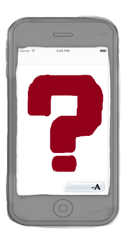
 I went onto photoshop to roughly design what the cards could look like. I wanted the card to be an actual iphone template in order to relate to the TV series, and I also changed 'Community Chest' to 'Community Coffin' to relate more to the show. In our group of 4, each individual explored designing something different, for example the actual board, the logo, the money, and the cards. By roughly trying out new designs we are able to put our creativity together for next lesson with the planning of the game. 
   These are good experiments because it allowed me to merge together multiple ideas to see if they work together, however I think it would be a useful thing to use not just an iphone, but experiment with the phone, using different brands etc.


FMP Showcase.

To complete this year (and the previous year) off we held a showcase in the Apex Hotel in Bath. This finished off the final part of my FMP a...